The documents in this section describe options of each report control available in the Report Designer.
In general, report controls allow you to represent information of different kinds (e.g. simple or formatted text, pictures, tables, etc.) in you report both static and dynamic, and to adjust your report's layout (by organizing controls within panels, and inserting page breaks at the required positions).
In the Report Designer, the available controls are listed in the Control Toolbox from which they are dropped onto the required bands.
You also can extend the standard functionality of each control by writing scripts for its available events.
This document consists of the following sections.
Available Controls
Add Controls to a Report
Available Controls
The following table lists the available controls (in the same order as in the Control Toolbox). For each control's options description, refer to the corresponding document.
|
|
The most basic Label control is intended to display text in your report. It can represent static or dynamic text, or both. In addition, it can be used to calculate standard summary functions across a data field. The Label's text can only be formatted as a whole. So, if it's required to differently format parts of text, use the Rich Text control. |
|
|
|
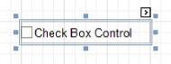
The Check Box control is intended to display True/False or Checked/Unchecked/Indeterminate states in a report, by displaying (or not) a check mark, which can be accompanied by a text description. |
|
|
|
The Rich Text control allows you to display formatted text in your report. It can represent static or dynamic text, or both. You can load content to the Rich Text from an external TXT or RTF file (which can also contain images) and then format any part of it. The formatting options include font face, styles and sizes, and color. |
|
|
|
The Picture Box control is intended to display images of numerous formats in a report. An image can be loaded from an external file, from a bound data source, or from a web location using the specified URL. |
|
|
|
The Panel control is a container that frames separate report controls to allow them to be easily moved, copied and pasted, and visually unite them in the report's preview (with borders or a uniform color background). |
|
|
The Table control is designed to arrange information in a tabular layout. It may contain any number of Rows comprised of individual Cells. Both Rows and Cells can be selected and customized individually. In most aspects, a Cell is similar to a Label, but can also contain other controls (e.g. Picture Box or Rich Text). |
|
|
|
The Line control draws a line of a specified direction, style, width and color. It can be used for both decoration and visual separation of a report's sections. The Line cannot cross bands, as opposed to the Cross-band Line control. |
|
|
|
The Shape control allows you to embed simple graphic objects into your report. You can choose one of multiple predefined shapes (e.g. rectangles, ellipses, arrows, polygons, crosses and brackets of various kinds). |
|
|
|
The Bar Code control transforms its content into a bar code of the specified type. Multiple standard bar code symbologies are supported. |
|
|
|
The Zip Code control transforms its content into a zip code. The width of a zip code's segment is adjustable. |
|
|
|
The Chart is a sophisticated control used to embed graphs into your report. It graphically represents a series of points using numerous 2D or 3D chart types. A Chart can be populated with points both manually (by specifying arguments and values for each point) and dynamically (by connecting it to the report's data source, or binding it to a separate one). |
|
|
|
The Pivot Grid control represents dynamic data (obtained from an underlying data source) in a cross- tabulated form to create cross-tab reports, similar to Pivot Tables in Microsoft Excel. Column headers display unique values from one data field, and row headers - from another field. Each cell displays a summary for the corresponding row and column values. By specifying different data fields, you can see different totals. This allows you to get a compact layout for a complex data analysis. |
|
|
The Page Info control is intended to add page numbers and system information (the current date and time or the current user name) into your report. As with many other controls, you can format this control's content. |
|
|
|
The Page Break control's sole purpose is to insert a page delimiter at any point within a report. |
|
|
|
The Cross-band Line control allows you to draw a line through several bands. This can be useful if it is required to visually emphasize a section consisting of multiple band areas. In other aspects, it is similar to a regular Line. |
|
|
|
The Cross-band Box control allows you to draw a rectangle through several bands. This can be useful if it is required to visually encompass a section consisting of multiple band areas. |
|
|
|
The Subreport control allows you to include other reports in your current report. |
Add Controls to a Report
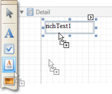
To create a control, drag it from the Toolbox panel onto the report area.
To automatically create a control bound to data, drag a field from the Field List panel, and drop it onto a report's surface. When dropping a field onto an existing control, this control will be bound to the data field.
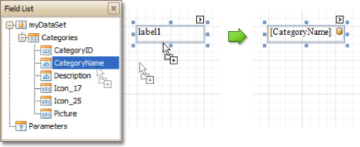
If you drag the field with the right mouse button, when the button is released the Context Menu is invoked. Use this menu to specify which control should be created.

To learn more on data binding for report controls, refer to Display Values from a Database (Bind Report Elements to Data).
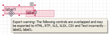
Note
When controls overlap, the report may be shown incorrectly when exported to some formats. Red markers and a report tooltip will warn of this situation. You may switch off the red warning marks via the report's Show Export Warnings property.
To learn how report controls can be relocated and resized, refer to Change Element Layout in Your Report and Controls Positioning.
The most basic Label control is intended to display text in your report. It can represent static or dynamic text, or both. In addition, it can be used to calculate standard summary functions across a data field. The 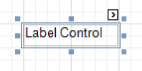
Label's text can only be formatted as a whole. So, if it's required to differently format parts of text, use the Rich Text control.
After a Label is added to a report, you can customize its text, appearance and other properties, which can be accessed in the Property Grid. The most important properties are also available via a control's Smart Tag, which makes it easy to perform common operations. And, the Formatting Toolbar allows you to easily adjust a Label's text formatting.
In the Property Grid, the Label control's properties are divided into the following groups.
Appearance
Background Color
Specifies the background color for the control. This option is also available in the Formatting Toolbar.
Borders, Border Color and Border Width
Specify border settings for the control.
Font
Specifies the font settings for the control. Some of these settings are available in the Formatting Toolbar.
Foreground Color
Specifies the text color for the control. This option is also available in the Formatting Toolbar.
Formatting Rules
Invokes the Formatting Rules Editor, allowing you to choose which rules should be applied to the control during report generation, and define the precedence of the applied rules. To learn more on this, refer to Conditionally Change a Control's Appearance.
Padding
Specifies indent values which are used to render the contents of a Label.
Style Priority
Specifies the priority of various style elements (such as background color, border color, etc.). For more information on style inheritance, refer to Understand Styles Concepts.
Styles
Specifies odd and even styles for the control, as well as to assign an existing style to the control (or a newly created one). For more information on style inheritance, refer to Understand Styles Concepts.
Text Alignment
Specifies the alignment of the control's text. This option is also available in the Formatting Toolbar.
Behavior
Anchor Vertically
Specifies the vertical anchoring style of a Label, so that after page rendering it stays attached to the top control, bottom control, or both. The property setting is useful for data-bound Labels located between upper and lower controls, which are allowed to resize depending on their contents.
Note that if the Anchor Vertically property is set to Bottom or Both, the Can Grow and Can Shrink property (see below) values are ignored, and don't participate in calculating a final height value of this control.
Angle
Specifies the rotation angle of the text. The measurement unit is a degree, and the orientation is counter-clockwise. Since standard HTML does not support text orientation, this parameter is ignored when a report is displayed within a web page.
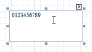
Auto Width
Specifies whether or not a Label's width should be automatically determined based on its text.
Can Grow
When this property is set to Yes, a Label's height can be automatically increased, if required, to display the text. If there are other controls below the current Label, they will be pushed down to prevent them from overlapping. Note that if a control overlaps the growing Label by even one pixel, it will not be pushed down by the growing Label.
Can Shrink
When this property is set to Yes, and the text does not completely fill a Label, then the Label's height will be decreased to the height of its text. If there are other controls below the current Label, they will be moved up to fill the gap. Note that if a control overlaps the shrinking Label by even one pixel, it will not be pushed up by the shrinking Label.
Keep Together
Specifies whether the contents of a Label can be horizontally split across pages. In other words, if a Label occupies more space than remains on the page, this property specifies whether this Label should be split between the current page and the next, or whether it will be printed entirely on the next page. This
property is in effect only when a Label's content does not fit on the current page. If it does not fit on the next page either, then the Label will be split, irrespective of this property's value.
Multiline
When this property is set to Yes, a Label processes newline characters found in the text to start a new line. For example, when editing a Label's text, you can insert a new line by pressing ENTER, and in this case, the Multiline property will be automatically set to Yes.
Process Duplicates
Determines the control's behavior when its data source contains consecutive repeating records. They can be processed as is (when the property is set to Leave), suppressed except for the first entry(Suppress) and suppressed with the blank space printed instead of the repeated records (Suppress and Shrink).
Process Null Values
Determines whether to process Null (blank) values if they appear in the control's data source. They can be processed as is (when the property is set to Leave), suppressed (Suppress) and suppressed with the blank space printed instead of the blank records (Suppress and Shrink).
Scripts
This property contains events, which you can handle with the required scripts. For more information on scripting, refer to Handle Events via Scripts.
Visible
Specifies whether the control should be visible in print preview.
Word Wrap
When this property is set to Yes, text entered into the multiline Label is wrapped to the next line if it doesn't fit the line or comes across a newline character. If the this property is set to No, text entered into the multiline Label will be displayed on the same line until a newline character is entered.
Data
(Data Bindings)
If the current report is bound to data, this property allows you to bind some of the control's properties (Bookmark, Navigation URL, Tag and Text) to a data field obtained from the report's data source, and to apply a format string to it. For more information on this, refer to Display Values from a Database (Bind Report Elements to Data).
Lines
Provides access to the Text property of a Label in the Multiline mode.
Summary
Allows you to perform calculations (summary, max, min, average, etc.) over a data field. For more information on calculating summaries, refer to Add Totals to a Report.
 Note
Note
Summarization is possible for a single data column only. To perform calculations with several data fields, use calculated fields.
Tag
This property allows you to add some additional information to the control; for example its id, by which it can then be accessible via scripts.
If the current report has a data source, the Tag property can be bound to a data field obtained from the data source. To do this, expand the (Data Bindings) property and in the Tag. Binding drop-down selector, select the required data field.
Text
Allows you to define a line of static text to be displayed. To type several lines of text, click the control's Smart Tag, and in the invoked actions list, click Edit Text, or use the Lines property. Note that when a Label is selected in the designer, you may simply start typing the text, and it will be automatically entered into the in-place editor.

If the current report has a data source, the Text property can be bound to a data field obtained from the data source. To do this, expand the (Data Bindings) property and in the Text.Binding drop-down selector, select the required data field. For more information on this, refer to Display Values from a Database (Bind Report Elements to Data).
Xlsx Format String
Specifies the native XLSX format string for the control's content, which is to be preserved when the report is being exported to XLSX. This format string is independent from the general value formatting.
Design
(Name)
Determines a control's name, by which it can be accessed in the Report Explorer, Property Grid or via scripts.
Layout
Location
Specifies the control's location, in report measurement units.
Size
Specifies the control's size, in report measurement units.
Snap Line Margin
Specifies the margin (in report measurement units), which is to be preserved around the control when it is aligned using Snap Lines, or when other controls are aligned next to it.
Navigation
Bookmark and Parent Bookmark
These properties are intended for the creation of a hierarchical structure within a report called a document map. For an explanation and help, refer to Add Bookmarks.
If the current report has a data source, the Bookmark property can be bound to a data field, obtained from the data source. To do this, expand the (Data Bindings) property, and in the Bookmark. Binding drop-down selector, select the required data field.
Navigation URL and Navigation Target
Use the Navigation URL property to specify a URL for web browser navigation, when a user clicks a Label. The web browser displays a page in a window or a frame as specified by the Navigation Target property. Note that a URL should have an appropriate prefix (e.g. "http://"). You can create cross-references within the report by assigning the name of the target control to the Navigation URL property, and setting the Navigation Target property to "_self". For more information, refer to Create Hyperlinks.
If the current report has a data source, the Navigation URL property can be bound to a data field obtained from the data source. To do this, expand the (Data Bindings) property, and in the Navigation URL. Binding drop-down selector, select the required data field.
The Check Box control is intended to display True/False or Checked/Unchecked/Indeterminate states in a report, by displaying (or not) a check mark, which can be accompanied by a text description.
In the Property Grid, the Check Box control's properties are divided into the following groups.
Appearance
Background Color
Specifies the background color for the control. This option is also available in the Formatting Toolbar.
Borders, Border Color and Border Width
Specify border settings for the control.
Font
Specifies the font settings for the control. Some of these settings are available in the Formatting Toolbar.
Foreground Color
Specifies the text color for the control. This option is also available in the Formatting Toolbar.
Formatting Rules
Invokes the Formatting Rules Editor allowing you to choose which rules should be applied to the control during report generation, and define the precedence of the applied rules. To learn more on this, refer to Conditionally Change a Control's Appearance.
Padding
Specifies indent values which are used to render the contents of a Check Box.
Style Priority
Allows you to define the priority of various style elements (such as background color, border color, etc.). For more information on style inheritance, refer to Understand Styles Concepts.
Styles
This property allows you to define odd and even styles for the control, as well as to assign an existing style to the control (or a newly created one). For more information on style inheritance, refer to Understand Styles Concepts.
Text Alignment
Allows you to change the alignment of the control's text. This option is also available in the Formatting Toolbar.
Behavior
Anchor Vertically
Specifies the vertical anchoring style of the control, so that after page rendering it stays attached to the top control, bottom control, or both. The property setting is useful for data-bound Check Boxes located between upper and lower controls, which are allowed to resize depending on their contents.
Keep Together
Specifies whether the contents of a Check Box can be horizontally split across pages. In other words, if a Check Box occupies more space than remains on the page, this property specifies whether this Check Box should be split between the current page and the next, or whether it will be printed entirely on the next page. This property is in effect only when a Check Box's content does not fit on the current page. If it does not fit on the next page either, then the Check Box will be split despite this property's value.
Visible
Specifies whether the control should be visible in print preview.
Scripts
This property contains events, which you can handle with the required scripts. For more information on scripting, refer to Handle Events via Scripts.
Word Wrap
When this property is set to Yes, text entered into a Check Box is wrapped to the next line if it doesn't fit the line.
Data
(Data Bindings)
If the current report is bound to data, this property allows you to bind some of the control's properties (Bookmark, Check State, Navigation URL, Tag and Text) to a data field obtained from the report's data source, and to apply a format string to it. For more information on this, refer to Display Values from a Database (Bind Report Elements to Data).
Check State
This property allows you to quickly specify the Checked/Unchecked/Indeterminate state of a Check Box (the Indeterminate state is displayed as a grayed out checked box.) Note that if you only want to use Checked and Unchecked states, you may use the Checked property, instead.
Checked
This property allows you to define whether a Check Box is checked or not.
Tag
This property allows you to add some additional information to the control; for example its id, by which it can then be accessible via scripts. If the current report has a data source, the Tag property can be bound to a data field obtained from the data source. To do this, expand the (Data Bindings) property and in the Tag. Binding drop-down selector, select the required data field.
Text
Allows you to define a line of static text to be displayed. Note that when a Check Box is selected in the designer, you may simply start typing the text, and it will be automatically entered into the in-place editor.

If the current report has a data source, the Text property can be bound to a data field obtained from the data source. To do this, expand the (Data Bindings) property, and in the Text. Binding drop-down selector, select the required data field. For more information on this, refer to Display Values from a Database (Bind Report Elements to Data).
Xlsx Format String
Specifies the native XLSX format string for the control's content, which is to be preserved when the report is being exported to XLSX. This format string is independent from the general value formatting.
Design
(Name)
Determines a control's name, by which it can be accessed in the Report Explorer, Property Grid or via scripts.
Layout
Location
Specifies the control's location, in report measurement units.
Size
Specifies the control's size, in report measurement units.
Snap Line Margin
Specifies the margin (in report measurement units), which is to be preserved around the control when it is aligned using Snap Lines, or when other controls are aligned next to it.
Navigation
Bookmark and Parent Bookmark
These properties are intended for the creation of a hierarchical structure within a report called a document map. For an explanation and help, refer to Add Bookmarks.
If the current report has a data source, the Bookmark property can be bound to a data field obtained from the data source. To do this, expand the (Data Bindings) property and in the Bookmark. Binding drop-down selector, select the required data field.
Navigation URL and Navigation Target
Use the Navigation URL property to specify a URL for web browser navigation when a user clicks a Check Box. The web browser displays a page in a window or a frame as specified by the Navigation Target property. Note that a URL should have an appropriate prefix (e.g. "http://"). You can create cross-references within the report by assigning the name of the target control to the Navigation URL property, and setting the Navigation Target property to "_self". For more information, refer to Create Hyperlinks.
If the current report has a data source, the Navigation URL property can be bound to a data field obtained from the data source. To do this, expand the (Data Bindings) property and in the Navigation URL. Binding drop-down selector, select the required data field.
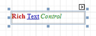
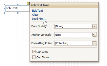
The Rich Text control allows you to display formatted text in your report. It can represent static or dynamic text, or both. You can load content to the Rich Text from an external TXT or RTF file (which can also contain images) and then format any part of it. The formatting options include font face, styles and sizes, and color.
A content from an external TXT or RTF file can be loaded to this control via its Smart Tag.
In the Property Grid, the Rich Text control's properties are divided into the following groups.
Appearance
Background Color
Specifies the background color for the control. This option is also available in the Formatting Toolbar .
Borders, Border Color and Border Width
Specify border settings for the control.
Font
Specifies the font settings for the control. Some of these settings are available in the Formatting Toolbar.
Foreground Color
Specifies the text color for the control. This option is also available in the Formatting Toolbar .
Formatting Rules
Invokes the Formatting Rules Editor allowing you to choose which rules should be applied to the control during report generation, and define the precedence of the applied rules. To learn more on this, refer to Conditionally Change a Control's Appearance.
Padding
Specifies indent values which are used to render the contents of the control.
Style Priority
Allows you to define the priority of various style elements (such as background color, border color, etc.). For more information on style inheritance, refer to Understand Styles Concepts.
Styles
This property allows you to define odd and even styles for the control, as well as to assign an existing style to the control (or a newly created one). For more information on style inheritance, refer to
Understand Styles Concepts.
Behavior
Anchor Vertically
Specifies the vertical anchoring style of the control, so that after page rendering it stays attached to the top control, bottom control, or both. The property setting is useful for data-bound controls located
between upper and lower controls, which are allowed to resize depending on their contents.
Note that if the Anchor Vertically property is set to Bottom or Both, the Can Grow and Can Shrink properties (see below) values are ignored, and don't participate in calculating a final height value of this control.
Can Grow
When this property is set to Yes, the control's height can be automatically increased, if required, to display the text. If there are other controls below the current control, they will be pushed down to prevent them from overlapping. Note that if a control overlaps the growing Rich Text by even one pixel, it will not be pushed down by the growing Rich Text.
Can Shrink
When this property is set to Yes, and the text does not completely fill a Rich Text, then the control's height will be decreased to the height of its text. If there are other controls below the current one, they will be moved up to fill the gap. Note that if a control overlaps the shrinking Rich Text by even one pixel, it will not be pushed up by the shrinking Rich Text.
Keep Together
Specifies whether the contents of the control can be horizontally split across pages. In other words, if the control occupies more space than remains on the page, this property specifies whether this control should be split between the current page and the next, or whether it will be printed entirely on the next page. This property is in effect only when the control's content does not fit on the current page. If it does not fit on the next page either, then the control will be split despite this property's value.
Process Duplicates
Determines the control's behavior when its data source contains consecutive repeating records. They can be processed as is (when the property is set to Leave), suppressed except for the first entry (Suppress) and suppressed with the blank space printed instead of the repeated records (Suppress and Shrink).
Process Null Values
Determines whether to process Null (blank) values if they appear in the control's data source. They can be processed as is (when the property is set to Leave), suppressed (Suppress) and suppressed with the
blank space printed instead of the blank records (Suppress and Shrink).
Scripts
This property contains events, which you can handle with the required scripts. For more information on scripting, refer to Handle Events via Scripts.
Visible
Specifies whether the control should be visible in print preview.
Data
(Data Bindings)
If the current report is bound to data, this property allows you to bind some of the control's properties (Bookmark, Navigation URL, Rtf and Tag) to a data field obtained from the report's data source, and to apply a format string to it. For more information on this, refer to Display Values from a Database (Bind Report Elements to Data).
Lines
Provides access to the Text property of the control, allowing you to input multiple lines of static text.
Tag
This property allows you to add some additional information to the control; for example its id, by which it can then be accessible via scripts.
If the current report has a data source, the Tag property can be bound to a data field obtained from the data source. To do this, expand the (Data Bindings) property, and in the Tag. Binding drop-down selector, select the required data field.
Text
Allows you to define a line of static text to be displayed. To type several lines of text, use the Lines property. Note that when the control is selected in the designer, you may simply start typing the text, and it will be automatically entered into the in-place editor.
If the current report has a data source, the Rtf property (instead of Text) can be bound to a data field obtained from the data source. To do this, expand the (Data Bindings) property and in the Rtf.Binding drop-down selector, select the required data field. For more information on this, refer to Display Values from a Database (Bind Report Elements to Data).
Design
(Name)
Determines a control's name, by which it can be accessed in the Report Explorer, Property Grid or via scripts.
Layout
Location
Specifies the control's location, in report measurement units.
Size
Specifies the control's size, in report measurement units.
Snap Line Margin
Specifies the margin (in report measurement units), which is to be preserved around the control when it is aligned using Snap Lines, or when other controls are aligned next to it.
Navigation
Bookmark and Parent Bookmark
These properties are intended for the creation of a hierarchical structure within a report, called a document map. For an explanation and help, refer to Add Bookmarks.
If the current report has a data source, the Bookmark property can be bound to a data field obtained from the data source. To do this, expand the (Data Bindings) property and in the Bookmark. Binding drop-down selector, select the required data field.
Navigation URL and Navigation Target
Use the Navigation URL property to specify a URL for web browser navigation when a user clicks the control. The web browser displays a page in a window or a frame as specified by the Navigation Target property. Note that a URL should have an appropriate prefix (e.g. "http://"). You can create cross-references within the report by assigning the name of the target control to the Navigation URL property, and setting the Navigation Target property to "_self". For more information, refer to Create Hyperlinks.
If the current report has a data source, the Navigation URL property can be bound to a data field obtained from the data source. To do this, expand the (Data Bindings) property, and in the Navigation URL. Binding drop-down selector, select the required data field.
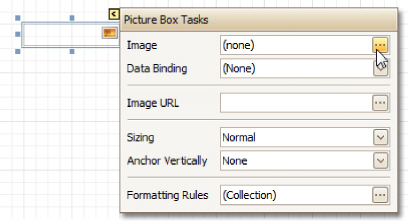
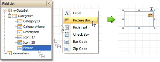
The Picture Box control is intended to display images of numerous formats in a report. An image can be loaded from an external file, from a bound data source, or from a web location using the specified URL.
The following image formats are supported: BMP, DIB, RLE, JPG, JPEG, JPE, JFIF, GIF, EMF, WMF, TIF, TIFF, PNG and ICO.
To quickly load an image from an external file, use the control's Smart Tag.
To bind the control to a data field containing images, right-click the corresponding Field List item, and then drag and drop it onto a report. This will invoke the Context Menu, where you can choose the Picture Box, and it will be automatically created and bound to the selected data field.
In the Property Grid, the Picture Box control's properties are divided into the following groups.
Appearance
Background Color
Specifies the background color for the control.
Borders, Border Color and Border Width
Specify border settings for the control.
Formatting Rules
Invokes the Formatting Rules Editor allowing you to choose which rules should be applied to the control during report generation, and define the precedence of the applied rules. To learn more on this, refer to Conditionally Change a Control's Appearance.
Padding
Specifies indent values which are used to render the contents of the control.
Style Priority
Allows you to define the priority of various style elements (such as background color, border color, etc.). For more information on style inheritance, refer to Understand Styles Concepts.
Styles
This property allows you to define odd and even styles for the control, as well as to assign an existing style to the control (or a newly created one). For more information on style inheritance, refer to Understand Styles Concepts.
Behavior
Anchor Vertically
Specifies the vertical anchoring style of the control, so that after page rendering it stays attached to the top control, bottom control, or both. The property setting is useful for data-bound controls located between upper and lower controls, which are allowed to resize depending on their contents.
Scripts
This property contains events, which you can handle with the required scripts. For more information on scripting, refer to Handle Events via Scripts.
Sizing
Defines the sizing mode of a contained image. To quickly adjust the image size and position within the control, click its Smart Tag, and choose Sizing.
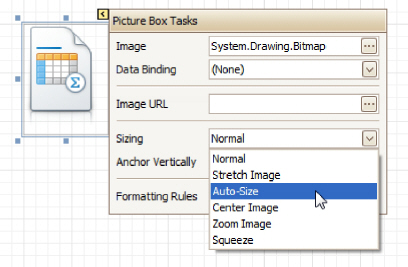
The image sizing settings are briefly described in the following table.
Mode Description
|
Normal |
The image is placed in the upper-left corner of the control. The image is clipped if it is larger than the Picture Box which contains it. |
|
Stretch Image |
The image within the control is stretched or shrunk to fit the size of a Picture Box. |
|
Auto-Size |
The Picture Box size is adjusted to that of the image it contains. |
|
Center Image |
The image is displayed in the center of the control. If the image is larger than the Picture Box, the outer edges are clipped. |
|
Zoom Image |
The image is sized proportionally (without clipping) for best fit into the control. |
|
Squeeze |
If the dimensions of a Picture Box exceed that of the image it contains, the image is centered and shown full-size. Otherwise, the image is resized to fit into the Picture Box's dimensions. |
Visible
Specifies whether the control should be visible in print preview.
Data
(Data Bindings)
If the current report is bound to data, this property allows you to bind some of the control's properties (Bookmark, Image, Image URL, Navigation URL and Tag) to a data field obtained from the report's data source, and to apply a format string to it. For more information on this, refer to Display Values from a Database (Bind Report Elements to Data).
Image
Specifies an image to display in the Picture Box control. When you click the ellipsis button, you will see the Open File dialog that enables you to specify the file to load. Then, this image is embedded into a report and saved within this report, so it is always available. Note that this increases the size of a saved report definition. If you want to save only the image path, and not the image itself, use the Image URL property instead.
Image URL
Specifies the URL of the image to display in the Picture Box control. It supports both absolute and relative paths. A relative path may be related to the Web site or to the current Web page. In the second case, the path to the image must start with the "~" symbol. Setting a relative path makes it easier to move the entire application to another directory on the server without having to update the code.
Tag
This property allows you to add some additional information to the control; for example its id, by which it can then be accessible via scripts. If the current report has a data source, the Tag property can be bound to a data field obtained from the data source. To do this, expand the (Data Bindings) property and in the Tag. Binding drop-down selector, select the required data field.
Design
(Name)
Determines a control's name, by which it can be accessed in the Report Explorer, Property Grid or via scripts.
Layout
Location
Specifies the control's location, in report measurement units.
Size
Specifies the control's size, in report measurement units.
Snap Line Margin
Specifies the margin (in report measurement units), which is to be preserved around the control when it is aligned using Snap Lines, or when other controls are aligned next to it.
Navigation
Bookmark and Parent Bookmark
These properties are intended for the creation of a hierarchical structure within a report called a document map. For an explanation and help, refer to Add Bookmarks.
If the current report has a data source, the Bookmark property can be bound to a data field obtained from the data source. To do this, expand the (Data Bindings) property and in the Bookmark. Binding drop-downn selector, select the required data field.
Navigation URL and Navigation Target
Use the Navigation URL property to specify a URL for web browser navigation when a user clicks the control. The web browser displays a page in a window or a frame as specified by the Navigation Target property. Note that a URL should have an appropriate prefix (e.g. "http://"). You can create cross-references within the report by assigning the name of the target control to the Navigation URL property, and setting the Navigation Target property to "_self". For more information, refer to Create Hyperlinks.
If the current report has a data source, the Navigation URL property can be bound to a data field obtained from the data source. To do this, expand the (Data Bindings) property and in the Navigation URL. Binding drop-down selector, select the required data field.
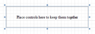
The Panel control is a container that frames separate report controls to allow them to be easily moved, copied and pasted, and visually unite them in the report's preview (with borders or a uniform color background).
Currently, there are several limitations on Panel usage. One of them is that Panel cannot shrink, and therefore cannot suppress the white space that appears when the controls inside are shrunk or collapsed. Also, the Panel cannot cross bands, as Cross-band Line and Cross-band Box can do.
In the Property Grid, the Panel's properties are divided into the following groups.
Appearance
Background Color
Specifies the background color for the control.
Borders, Border Color and Border Width
Specify border settings for the control.
Formatting Rules
Invokes the Formatting Rules Editor allowing you to choose which rules should be applied to the control during report generation, and define the precedence of the applied rules. To learn more on this, refer to Conditionally Change a Control's Appearance.
Padding
Specifies indent values which are used to render the contents of controls contained in a Panel.
Style Priority
Allows you to define the priority of various style elements (such as background color, border color, etc.). For more information on style inheritance, refer to Understand Styles Concepts.
Styles
This property allows you to define odd and even styles for the control, as well as to assign an existing style to the control (or a newly created one). For more information on style inheritance, refer to
Understand Styles Concepts.
Behavior
Anchor Vertically
Specifies the vertical anchoring style of the control, so that after page rendering it stays attached to the top control, bottom control, or both.
Note that if the Anchor Vertically property is set to Bottom or Both, the Can Grow property (see below) values are ignored, and don't participate in calculating a final height value of this control.
Can Grow
When this property is set to Yes, the control's height can be automatically increased, if required, to display the text. If there are other controls below the current control, they will be pushed down to prevent them from overlapping. Note that if a control overlaps the growing Panel by even one pixel, it will not be pushed down by the growing Panel.
Keep Together
Specifies whether the contents of the control can be horizontally split across pages. In other words, if the control occupies more space than remains on the page, this property specifies whether this control should be split between the current page and the next, or whether it will be printed entirely on the next page. This property is in effect only when the control's content does not fit on the current page. If it does not fit on the next page either, then the control will be split despite this property's value.
Scripts
This property contains events, which you can handle with the required scripts. For more information on scripting, refer to Handle Events via Scripts.
Visible
Specifies whether the control should be visible in print preview.
Data
(Data Bindings)
If the current report is bound to data, this property allows you to bind some of the control's properties (Bookmark, Navigation URL and Tag) to a data field obtained from the report's data source, and to apply a format string to it. For more information on this, refer to Display Values from a Database (Bind Report Elements to Data).
Tag
This property allows you to add some additional information to the control; for example its id, by which it can then be accessible via scripts. If the current report has a data source, the Tag property can be bound to a data field obtained from the data source. To do this, expand the (Data Bindings) property and in the Tag. Binding drop-down selector, select the required data field.
Design
(Name)
Determines a control's name, by which it can be accessed in the Report Explorer, Property Grid or via scripts.
Layout
Location
Specifies the control's location, in report measurement units.
Size
Specifies the control's size, in report measurement units.
Snap Line Margin
Specifies the margin (in report measurement units), which is to be preserved around the control when it is aligned using Snap Lines, or when other controls are aligned next to it.
Snap Line Padding
Specifies the padding (in report measurement units), which is to be preserved within the control when controls it contains are aligned using Snap Lines.
Navigation
Bookmark and Parent Bookmark
These properties are intended for the creation of a hierarchical structure within a report called a document map. For an explanation and help, refer to Add Bookmarks.
If the current report has a data source, the Bookmark property can be bound to a data field obtained from the data source. To do this, expand the (Data Bindings) property and in the Bookmark. Binding drop-down selector, select the required data field.
Navigation URL and Navigation Target
Use the Navigation URL property to specify a URL for web browser navigation when a user clicks the control. The web browser displays a page in a window or a frame as specified by the Navigation Target property. Note that a URL should have an appropriate prefix (e.g. "http://"). You can create cross-references within the report by assigning the name of the target control to the Navigation URL property, and setting the Navigation Target property to "_self". For more information, refer to Create Hyperlinks.
If the current report has a data source, the Navigation URL property can be bound to a data field obtained from the data source. To do this, expand the (Data Bindings) property and in the Navigation URL. Binding drop-down selector, select the required data field.
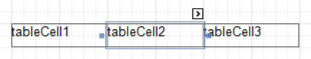
The Table control is designed to arrange information in a tabular layout. It may contain any number of Rows comprised of individual Cells. Both Rows and Cells can be selected and customized individually. In most aspects, a Cell is similar to a Label, but can also contain other controls (e.g. Picture Box or Rich Text).
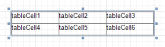
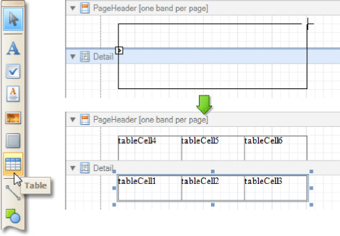
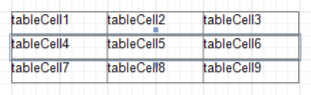
When a Table is dropped onto a band from the Toolbox, it has one row and three columns. If you click and drag over several bands, the resulting table will be split by the bands into several tables. This creates a table header and the detail table with one mouse move.
When you drag and drop an entire data table from the Field List, a Table with cells bound to the corresponding data fields is created automatically.
A table's elements are managed by using its Context Menu.
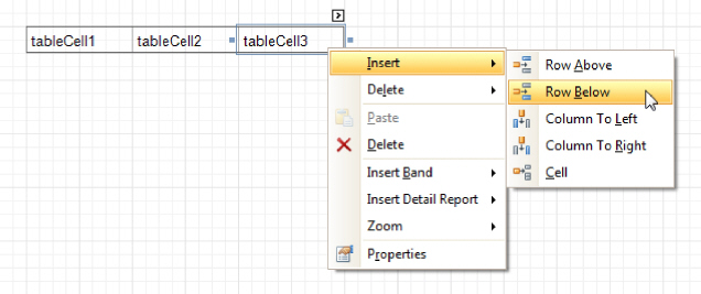
The whole Table, or its individual Row or Cell can be selected either in the Report Designer, the Report Explorer or the drop-down selector of the Property Grid.
In the Property Grid, the Table's properties are divided into the following groups.
Appearance
Background Color
Specifies the background color for the control. This option is also available in the Formatting Toolbar.
Borders, Border Color and Border Width
Specify border settings for the control.
Font
Specifies the font settings for the control. Some of these settings are available in the Formatting Toolbar.
Foreground Color
Specifies the text color for the control. This option is also available in the Formatting Toolbar.
Formatting Rules
Invokes the Formatting Rules Editor, allowing you to choose which rules should be applied to the control during report generation, and define the precedence of the applied rules. To learn more on this, refer to Conditionally Change a Control's Appearance.
Padding
Specifies indent values which are used to render the contents of a Table's cells.
Style Priority
Allows you to define the priority of various style elements (such as background color, border color, etc.). For more information on style inheritance, refer to Understand Styles Concepts.
Styles
This property allows you to define odd and even styles for the control, as well as to assign an existing style to the control (or a newly created one). For more information on style inheritance, refer to
Understand Styles Concepts.
Text Alignment
Allows you to change the alignment of a Table's text. This option is also available in the Formatting Toolbar.
Behavior
Anchor Vertically
Specifies the vertical anchoring style of a Table, so that after page rendering it stays attached to the top control, bottom control, or both.
Keep Together
Specifies whether the contents of a Table can be horizontally split across pages. In other words, if a Table occupies more space than remains on the page, this property specifies whether the Table should be split between the current page and the next, or whether it will be printed entirely on the next page. This
property is in effect only when a Table's content does not fit on the current page. If it does not fit on the next page either, then the Table will be split despite this property's value.
Scripts
This property contains events, which you can handle with the required scripts. For more information on scripting, refer to Handle Events via Scripts.
Visible
Specifies whether the control should be visible in print preview.
Data
Tag
This property allows you to add some additional information to the control; for example its id, by which it can then be accessible via scripts.
Design
(Name)
Determines a control's name, by which it can be accessed in the Report Explorer, Property Grid or via scripts.
Layout
Location
Specifies the control's location, in report measurement units.
Size
Specifies the control's size, in report measurement units.
Snap Line Margin
Specifies the margin (in report measurement units), which is to be preserved around the control when it is aligned using Snap Lines, or when other controls are aligned next to it.
Navigation
Bookmark and Parent Bookmark
These properties are intended for the creation of a hierarchical structure within a report called a document map. For an explanation and help, refer to Add Bookmarks.
If the current report has a data source, the Bookmark property can be bound to a data field obtained from the data source. To do this, expand the (Data Bindings) property and in the Bookmark. Binding drop-down selector, select the required data field.
The Table Row Control represents a single row within a Table.
This control is useful for changing the layout of the entire row. Although in this document, a Row is described as a separate control, in fact most of its properties are actually applied to the Cells contained within the selected row.
In the Property Grid, the Table Row's properties are divided into the following groups.
Appearance
Background Color
Specifies the background color for the control. This option is also available in the Formatting Toolbar.
Borders, Border Color and Border Width
Specify border settings for the control.
Font
Specifies the font settings for the control. Some of these settings are available in the Formatting Toolbar.
Foreground Color
Specifies the text color for the control. This option is also available in the Formatting Toolbar.
Formatting Rules
Invokes the Formatting Rules Editor, allowing you to choose which rules should be applied to the control during report generation, and define the precedence of the applied rules. To learn more on this, refer to Conditionally Change a Control's Appearance.
Padding
Specifies indent values which are used to render the contents of a Row.
Style Priority
Allows you to define the priority of various style elements (such as background color, border color, etc.). For more information on style inheritance, refer to Understand Styles Concepts.
Styles
This property allows you to define odd and even styles for the control, as well as to assign an existing style to the control (or a newly created one). For more information on style inheritance, refer to Understand Styles Concepts.
Text Alignment
Allows you to change the alignment of the control's text. This option is also available in the Formatting Toolbar.
Behavior
Keep Together
Specifies whether the contents of a Row can be horizontally split across pages. In other words, if a Row occupies more space than remains on the page, this property specifies whether this Row should be split between the current page and the next, or whether it will be printed entirely on the next page. This property is in effect only when a Row's content does not fit on the current page. If it does not fit on the next page either, then the Row will be split despite this property's value.
Scripts
This property contains events, which you can handle with the required scripts. For more information on scripting, refer to Handle Events via Scripts.
Visible
Specifies whether the control should be visible in print preview.
Data
Tag
This property allows you to add some additional information to the control; for example its id, by which it can then be accessible via scripts.
Design
(Name)
Determines a control's name, by which it can be accessed in the Report Explorer, Property Grid or via scripts.
Layout
Height
Specifies the Row´s height, in report measurement units.
Snap Line Margin
Specifies the margin (in report measurement units), which is to be preserved around the control when it is aligned using Snap Lines, or when other controls are aligned next to it.
The Table Cell control represents an individual cell within a Table.
In general, the Table Cell control's properties are similar to the properties of the Label control.
In the Property Grid, the Table Cell's properties are divided into the following groups.
Appearance
Background Color
Specifies the background color for the control. This option is also available in the Formatting Toolbar.
Borders, Border Color and Border Width
Specify border settings for the control.
Font
Specifies the font settings for the control. Some of these settings are available in the Formatting Toolbar.
Foreground Color
Specifies the text color for the control. This option is also available in the Formatting Toolbar.
Formatting Rules
Invokes the Formatting Rules Editor, allowing you to choose which rules should be applied to the control during report generation, and define the precedence of the applied rules. To learn more on this, refer to Conditionally Change a Control's Appearance.
Padding
Specifies indent values which are used to render the contents of a Label.
Style Priority
Allows you to define the priority of various style elements (such as background color, border color, etc.). For more information on style inheritance, refer to Understand Styles Concepts.
Styles
This property allows you to define odd and even styles for the control, as well as to assign an existing style to the control (or a newly created one). For more information on style inheritance, refer to Understand Styles Concepts.
Text Alignment
Allows you to change the alignment of the control's text. This option is also available in the Formatting Toolbar.
Behavior
Angle
Specifies the rotation angle of a Cell's text. The measurement unit is a degree, and the orientation is counter-clockwise. Since standard HTML does not support text orientation, this parameter is ignored when a report is displayed within a web page.
Can Grow
When this property is set to Yes, a Cell's height can be automatically increased, if required, to display the text. If there are other controls below the current Cell, they will be pushed down to prevent them from overlapping. Note that if a control overlaps the growing Cell by even one pixel, it will not be pushed down by the growing Cell.
Can Shrink
When this property is set to Yes, and the text does not completely fill a Cell, then the Cell's height will be decreased to the height of its text. If there are other controls below the current Cell, they will be moved up to fill the gap. Note that if a control overlaps the shrinking Cell by even one pixel, it will not be pushed up by the shrinking Cell.
Keep Together
Specifies whether the contents of a Cell can be horizontally split across pages. In other words, if a Cell occupies more space than remains on the page, this property specifies whether this Cell should be split between the current page and the next, or whether it will be printed entirely on the next page. This property is in effect only when a Cell's content does not fit on the current page. If it does not fit on the next page either, then the Cell will be split despite this property's value.
Multiline
When this property is set to Yes, a Cell processes newline characters found in the text to start a new line. For example, when editing a Cell's text, you can insert a new line by pressing ENTER, and in this case the Multiline property will be automatically set to Yes.
Process Duplicates
Determines the control's behavior when its data source contains consecutive repeating records. They can be processed as is (when the property is set to Leave), suppressed except for the first entry (Suppress) and suppressed with the blank space printed instead of the repeated records (Suppress and Shrink).
Process Null Values
Determines whether to process Null (blank) values if they appear in the control's data source. They can be processed as is (when the property is set to Leave), suppressed (Suppress) and suppressed with the blank space printed instead of the blank records (Suppress and Shrink).
Scripts
This property contains events, which you can handle with the required scripts. For more information on scripting, refer to Handle Events via Scripts.
Visible
Specifies whether the control should be visible in print preview.
Word Wrap
When this property is set to Yes, text entered into the multiline Cell is wrapped to the next line if it doesn't fit the line or comes across a newline character. If the this property is set to No, text entered into the multiline Cell will be displayed on the same line until a newline character is entered.
Data
(Data Bindings)
If the current report is bound to data, this property allows you to bind some of a Cell's properties (Bookmark, Navigation URL, Tag and Text) to a data field obtained from the report's data source, and to apply a format string to it. For more information on this, refer to Display Values from a Database (Bind Report Elements to Data).
Lines
Provides access to the Text property of a Cell in the Multiline mode.
Summary
Allows you to perform calculations (summary, max, min, average, etc.) over a data field. For more information on calculating summaries, refer to Add Totals to a Report.
 Note
Note
Summarization is possible for a single data column only. To perform calculations with several data fields, use calculated fields.
Tag
his property allows you to add some additional information to the control; for example its id, by which it can then be accessible via scripts.
If the current report has a data source, the Tag property can be bound to a data field obtained from the data source. To do this, expand the (Data Bindings) property and in the Tag. Binding drop-down selector, select the required data field.
Text
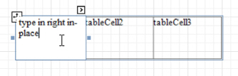
Allows you to define a line of static text to be displayed. When a Cell is selected in the designer, you may simply start typing the text, and it will be automatically entered into the in-place editor.
To type several lines of text, use the Lines property.
If the current report has a data source, the Text property can be bound to a data field obtained from the data source. To do this, expand the (Data Bindings) property, and in the Text. Binding drop-down selector, select the required data field. For more information on this, refer to Display Values from a Database (Bind Report Elements to Data).
Xlsx Format String
Specifies the native XLSX format string for the control's content, which is to be preserved when the report is being exported to XLSX. This format string is independent from the general value formatting.
Design
(Name)
Determines a control's name, by which it can be accessed in the Report Explorer, Property Grid or via scripts.
Layout
Width
Specifies the Cell´s width, in report measurement units.
Snap Line Margin
Specifies the margin (in report measurement units), which is to be preserved around the control when it is aligned using Snap Lines, or when other controls are aligned next to it.
Navigation
Bookmark and Parent Bookmark
These properties are intended for the creation of a hierarchical structure within a report called a document map. For an explanation and help, refer to Add Bookmarks.
If the current report has a data source, the Bookmark property can be bound to a data field obtained from the data source. To do this, expand the (Data Bindings) property and in the Bookmark. Binding drop-down selector, select the required data field.
Navigation URL and Navigation Target
Use the Navigation URL property to specify a URL for web browser navigation when a user clicks a Cell. The web browser displays a page in a window or a frame as specified by the Navigation Target property. Note that a URL should have an appropriate prefix (e.g. "http://"). You can create cross-references within the report by assigning the name of the target control to the Navigation URL property, and setting the Navigation Target property to "_self". For more information, refer to Create Hyperlinks.
If the current report has a data source, the Navigation URL property can be bound to a data field obtained from the data source. To do this, expand the (Data Bindings) property and in the Navigation URL. Binding drop-down selector, select the required data field.
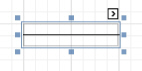
The Line control draws a line of a specified direction, style, width and color. It can be used for both decoration and visual separation of a report's sections. The Line cannot cross bands, as opposed to the Cross-band Line control.
In the Property Grid, the Line's properties are divided into the following groups.
Appearance
Background Color
Specifies the background color for the control.
Borders, Border Color and Border Width
Specify border settings for the control.
Foreground Color
Specifies the Line's color.
Formatting Rules
Invokes the Formatting Rules Editor allowing you to choose which rules should be applied to the control during report generation, and define the precedence of the applied rules. To learn more on this, refer to Conditionally Change a Control's Appearance.
Line Direction
The line can be drawn vertically, horizontally and from one corner of the rectangle, representing the Line control, to another, across the rectangle. That is, Vertical, Horizontal, Slant and Back Slant types.
Line Style
You can select the solid (by default), dashed, dotted or mixed style for the line.
Line Width
Specifies the Line's width, in report measurement units.
Padding
Specifies indent values which are used to render the contents of the control.
Style Priority
Allows you to define the priority of various style elements (such as background color, border color, etc.). For more information on style inheritance, refer to Understand Styles Concepts.
Styles
This property allows you to define odd and even styles for the control, as well as to assign an existing style to the control (or a newly created one). For more information on style inheritance, refer to Understand Styles Concepts.
Behavior
Anchor Vertically
Specifies the vertical anchoring style of the control, so that after page rendering it stays attached to the top control, bottom control, or both.
Keep Together
Specifies whether the contents of the control can be horizontally split across pages. In other words, if the control occupies more space than remains on the page, this property specifies whether this control should be split between the current page and the next, or whether it will be printed entirely on the next page. This property is in effect only when the control's content does not fit on the current page. If it does not fit on the next page either, then the control will be split despite this property's value.
Scripts
This property contains events, which you can handle with the required scripts. For more information on scripting, refer to Handle Events via Scripts.
Visible
Specifies whether the control should be visible in print preview.
Data
Tag
This property allows you to add some additional information to the control; for example its id, by which it can then be accessible via scripts.
(Data Bindings)
If the current report is bound to data, this property allows you to bind the control's Tag property.
Design
(Name)
Determines a control's name, by which it can be accessed in the Report Explorer, Property Grid or via scripts.
Layout
Height
Specifies the Row´s height, in report measurement units.
Snap Line Margin
Specifies the margin (in report measurement units), which is to be preserved around the control when it is aligned using Snap Lines, or when other controls are aligned next to it.
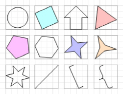
The Shape control allows you to embed simple graphic objects into your report. You can choose one of multiple predefined shapes (e.g. rectangles, ellipses, arrows, polygons, crosses and brackets of various kinds).
In the Property Grid, the Shape's properties are divided into the following groups.
Appearance
Background Color
Specifies the background color for the control. This option is also available in the Formatting Toolbar.
Borders, Border Color and Border Width
Specify border settings for the control.
Fill Color
Specifies the color to fill the contour of a Shape, if applicable. It is transparent by default.
Foreground Color
Determines the color of a Shape's contour. This option is also available in the Formatting Toolbar.
Formatting Rules
Invokes the Formatting Rules Editor allowing you to choose which rules should be applied to the control during report generation, and define the precedence of the applied rules. To learn more on this, refer to Conditionally Change a Control's Appearance.
Line Width
Here you can set the width of a line used to draw the Shape, expressed in the measure units defined by the report's Measure Units property. To learn more about this, refer to Change Measurement Units for a Report.
Padding
Specifies indent values which are used to render the contents of the control.
Style Priority
Allows you to define the priority of various style elements (such as background color, border color, etc.). For more information on style inheritance, refer to Understand Styles Concepts.
Styles
This property allows you to define odd and even styles for the control, as well as to assign an existing style to the control (or a newly created one). For more information on style inheritance, refer to Understand Styles Concepts.
Behavior
Anchor Vertically
Specifies the vertical anchoring style of the control, so that after page rendering it stays attached to the top control, bottom control, or both.
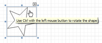
Angle
The value in degrees specifies the rotation angle of a Shape. It indicates counterclockwise rotation.
You can hold CTRL while pressing the left mouse button to rotate a Shape within the control's borders
.
Scripts
This property contains events, which you can handle with the required scripts. For more information on scripting, refer to Handle Events via Scripts.
Shape
Determines which of the various built-in shapes to use within the control. A certain shape has its own unique set of properties. The following list is intended to give a brief overview of these special properties specific to a certain shape.
|
Property |
Description |
Supported by Shapes |
|
Fillet |
This property specifies how much a Shape's corners are rounded. It enables display of rounded boxes and triangles. |
Arrows, Polygons, Stars and Cross |
|
Number of Sides |
This property allows you to set the number of sides. |
Polygons |
|
Count of Star Points |
This property allows you to set the number of star points. |
Stars |
|
Concavity |
Defines the level of inward-curve for the lines connecting the vertices of a Star. It may be an integer in the range of 0 - 100. |
Stars |
|
Tip's Length |
This property specifies the length of the Bracket's ends. |
Bracket and Brace |
|
Tail's Length |
This property specifies the tail length of a Brace. |
Brace |
Stretch
If the Shape is rotated to some degree (that is, its Angle property is not zero), you may turn on the Stretch property. The Shape image will be stretched to cover maximum space within the control's borders.
Visible
Specifies a value indicating whether the current control should be printed (when set to Yes) or hidden (No) on report generation.
Data
(Data Bindings)
If the current report is bound to data, this property allows you to bind some of the control's properties (Bookmark, Navigation URL and Tag) to a data field obtained from the report's data source, and to apply a format string to it. For more information on this, refer to Display Values from a Database (Bind Report Elements to Data).
Tag
This property allows you to add some additional information to the control; for example its id, by which it can then be accessible via scripts. If the current report has a data source, the Tag property can be bound to a data field obtained from the data source. To do this, expand the (Data Bindings) property and in the Tag. Binding drop-down selector, select the required data field.
Design
(Name)
Determines a control's name, by which it can be accessed in the Report Explorer, Property Grid or via scripts.
Layout
Location
Specifies the control's location, in report measurement units.
Size
Specifies the control's size, in report measurement units.
Snap Line Margin
Specifies the margin (in report measurement units), which is to be preserved around the control when it is aligned using Snap Lines, or when other controls are aligned next to it.
Navigation
Bookmark and Parent Bookmark
These properties are intended for the creation of a hierarchical structure within a report called a document map. For an explanation and help, refer to Add Bookmarks.
If the current report has a data source, the Bookmark property can be bound to a data field obtained from the data source. To do this, expand the (Data Bindings) property and in the Bookmark. Binding drop-down selector, select the required data field.
Navigation URL and Navigation Target
Use the Navigation URL property to specify a URL for web browser navigation when a user clicks the control. The web browser displays a page in a window or a frame as specified by the Navigation Target property. Note that a URL should have an appropriate prefix (e.g. "http://"). You can create cross-references within the report by assigning the name of the target control to the Navigation URL property, and setting the Navigation Target property to "_self". For more information, refer to Create Hyperlinks.
If the current report has a data source, the Navigation URL property can be bound to a data field obtained from the data source. To do this, expand the (Data Bindings) property and in the Navigation URL. Binding drop-down selector, select the required data field.
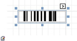
The Bar Code control transforms its content into a bar code of the specified type. Multiple standard bar code symbologies are supported.
Note: The barcode quality can degrade when the report is exported to formats other than PDF. To ensure reliable barcode recognition, print the report directly from an application using the native printing methods. The Module and Auto-Module properties of a control should be used with care.
In the Property Grid, the Bar Code's properties are divided into the following groups.
Appearance
Alignment
Determines the alignment of the barcode image within the control. To define the text alignment, use the Text Alignment property.
Background Color
Specifies the background color for the control. This option is also available in the Formatting Toolbar).
Borders, Border Color and Border Width
Specify border settings for the control.
Font
Specifies the font settings for the control. Some of these settings are available in the Formatting Toolbar.
Foreground Color
Specifies the text and image color for the bar code. This option is also available in the Formatting Toolbar (  ).
).
Formatting Rules
Invokes the Formatting Rules Editor, allowing you to choose which rules should be applied to the control during report generation, and define the precedence of the applied rules. To learn more on this, refer to Conditionally Change a Control's Appearance.
Padding
Specifies indent values which are used to render the contents of a Bar Code.
Style Priority
Allows you to define the priority of various style elements (such as background color, border color, etc.). For more information on style inheritance, refer to Understand Styles Concepts.
Styles
This property allows you to define odd and even styles for the control, as well as to assign an existing style to the control (or a newly created one). For more information on style inheritance, refer to Understand Styles Concepts.
Text Alignment
Allows you to change the alignment of the control's text. This option is also available in the Formatting Toolbar. To define the alignment of the barcode image, use the Alignment property.
Behavior
Anchor Vertically
Specifies the vertical anchoring style of the control, so that, after page rendering, it stays attached to the top control, bottom control, or both.
Auto-Module
When this property is set to Yes, the barcode image is stretched to fit the entire control's width. When this option is turned off, this behavior is determined by the Module property.
Keep Together
Specifies whether the contents of the control can be horizontally split across pages. In other words, if the control occupies more space than remains on the page, this property specifies whether this Bar Code should be split between the current page and the next, or whether it will be printed entirely on the next page. This property is in effect only when a Bar Code's content does not fit on the current page. If it does not fit on the next page either, then the Bar Code will be split, despite this property's value.
Module
Specifies the width of the narrowest bar or space in the barcode, in report measurement units. You may set this property to Yes for automatic adjustment of its value, when the control is resized. Note that if the Module value is too low, the barcode output may become unreadable by a barcode scanner.
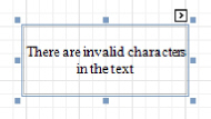
When the Auto-Module property is set to No, there could be a situation when the barcode image generated with the current setting of Module property is larger than the control itself. In this case, the control displays a warning, as illustrated below.
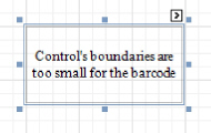
So, increase the dimensions of the control, to avoid this.
Orientation
The barcode image within the control can be rotated. If you need this feature, use the Orientation property to specify one of four possible orientations (Normal, Upside Down, Rotate to the Left and Rotate to the Right) for an image within the control.
Scripts
This property contains events, which you can handle with the required scripts. For more information on scripting, refer to Handle Events via Scripts.
Show Text
Determines whether to display the numerical value, or only the barcode within the control.
Symbology
The Symbology defines the mapping between barcode text and an image. Currently, the Bar Code control supports only linear 1D symbologies. They are listed in the following table:
|
Symbology |
Description |
|
Codabar |
The Codabar is an old format that uses discrete, self- checking symbology, capable of encoding 16 different characters, plus an additional 4 start/stop characters. You should also specify the Start and Stop Symbols and Wide Narrow Ratio properties. |
|
Code11 |
Code 11, also known as USD-8, was developed as a high-density numerical-only symbology. The symbology is discrete, and is able to encode the numbers 0 through to 9, the dash symbol (-), and start/stop characters. |
|
Code128 |
Code 128 has been widely implemented. It is a high- density symbology which permits encoding messages of arbitrary lengths of any character of the ASCII character set. The symbology includes a checksum digit for verification. You should also specify the Character Set. The recommended setting is Auto Charset. |
|
Code39 |
Code 39 is also known as "3 of 9 Code" and "USD-3". It can encode uppercase letters (A through Z), digits (0 through 9) and several special characters like the $ sign. The Calculate a Checksum and Wide Narrow Ratio (which should be in a range of 2.2 -3) properties can also be specified. |
|
Code39Extended |
This is an extension of Code 39, also known as "Full ASCII Code 39". It is capable of encoding all 128 ASCII characters. The Calculate a Checksum and Wide Narrow Ratio (which should be in a range of 2.2 -3) properties can be specified. |
|
Code93 |
Code 93 was designed to supplement and improve Code 39. It is an alphanumeric, variable length symbology, providing higher reliability and density than Code 39. The Calculate a Checksum property can be specified. |
|
Code93Extended |
It enables encoding of all 128 ASCII characters using Code 93's "Full ASCII Mode". This is accomplished by using the ($), (/), (%), and (+) symbols as "shift" characters. The Calculate a Checksum property can be specified. |
|
CodeMSI |
MSI symbology, also known as Modified Plessey, is a low-density, numerical only symbology. To specify the checksum, use the MSI Checksum property. It can be set to None, Modulo 10 and Double Modulo 10. |
|
DataMatrix |
Data Matrix ECC200 code is a two-dimensional matrix barcode consisting of black and while "cells" arranged in a square or a rectangular pattern. The encoded information can be text or raw data. |
|
EAN128 |
UCC/EAN-128 symbology has the newer name GS1-It is based on the Code128 standard, additionally specifying the Application Identifiers for data sections within the code. It includes best before dates, batch numbers, quantities, weights and other attributes. The Character Set property can be specified (Auto Charset is the recommended value). The FNC1 Functional Character property defines a symbol that is not included in a bar code when met in text, but used to generate the application identifiers. The Human-Readable Text property, when set to Yes, inserts parentheses into the text below the bar code for better readability. |
|
EAN13 |
The EAN-13 barcode contains 13 digits, no letters or other characters. The first two or three digits represent the country. The leading zero actually signifies the USA, and UPC-A coding. The last digit is the checksum digit. The control calculates it automatically and it should not be present in the control's text string. So, make sure that the text for this symbology contains no more than 12 digits. If fewer digits are supplied, the string is padded with zeroes on the left. |
|
EAN8 |
EAN-8 is a shortened version of the EAN-13 code. It includes a 2 or 3 digit country code, 4 of 5 data digits (depending on the length of the country code), and a checksum digit. The control calculates the checksum digit automatically and it should not be present in the control's text string. So, make sure that the text for this symbology contains no more than 7 digits. If fewer digits are supplied, the string is padded with zeroes on the left. |
|
Industrial2of5 |
The Industrial (or non-interleaved) 2 of 5 code is a numerical, low-density symbology, based on two-out- of-five code. The Calculate a Checksum and Wide Narrow Ratio (which should be greater than or equal to 2.5) properties can be specified. |
|
Interleaved2of5 |
The Interleaved 2 of 5 code is a higher-density numerical symbology, based on two-out-of-five code. The Calculate a Checksum and Wide Narrow Ratio (which should be greater than or equal to 2.5) properties can be specified. |
|
Matrix2of5 |
A variant of non-interleaved 2 of 5 code. It is a numerical only symbology. The Calculate a Checksum and Wide Narrow Ratio (which should be greater than or equal to 2.5) properties can be specified. |
|
PDF417 |
This Portable Data File symbology is used in a variety of applications, and can also be used to generate postage accepted by the United States Postal Service. It consists of a variable number of rows, each of which is like a small linear bar code. Among other options, the Error Correction Level specifies the amount of redundancy, to protect a barcode's legibility. |
|
PostNet |
This symbology is used by the United States Postal Service to assist in directing mail. The code usually contains the zip-code and delivery point number. Unlike most other barcodes, PostNet actually encodes data in the height of the bars. |
|
QR Code |
QR (Quick Response) Code is a popular two- dimensional matrix barcode that consists of black modules arranged in a square pattern on a white background. |
|
UPCA |
The UPC-A barcode contains 12 digits, no letters or other characters. The first digit is the prefix signifying the product type. The last digit is the "check digit". The check digit is calculated using the first eleven figures when the barcode is constructed. So, for a correct UPC-A, make sure that the text contains no more than 11 digits. If there are fewer than 11, the string is padded with zeroes on the left. |
|
UPCE0 |
This symbology is a variation of UPC-A which allows for a more compact barcode by eliminating "extra" zeros. The first digit is always zero; the last digit is a checksum digit of the original UPC-A code. Not every UPC-A code can be transformed into UPC-E0. E.g., the control's text string "4210000526" is displayed by UPC-E0 symbology as "04252614" and represents the "042100005264" UPC-A code (check digit included). |
|
UPCE1 |
This symbology is a variation of UPC-A, which allows for a more compact barcode by eliminating "extra" zeros. The first digit is always 1, and the last digit is a checksum digit of the original UPC-A code. Not every UPC-A code can be transformed into UPC-E1. E.g., the control's text string "4210000526" is displayed by UPC-E1 symbology as "14252611" and represents the "142100005261" UPC-A code (check digit included). |
|
UPCSupplemental2 |
This is a supplemental two-digit barcode. Make sure that the control's text string contains two digits. |
|
UPCSupplemental5 |
This is a supplemental five-digit barcode, usually used to indicate the suggested retail price of a book. Make sure that the control's text string contains five digits. |
Visible
Specifies whether the control should be visible in print preview.
|
Data |
(Data Bindings) If the current report is bound to data, this property allows you to bind some of the control's properties (Bookmark, Navigation URL, Tag and Text) to a data field obtained from the report's data source, and to apply a format string to it. For more information on this, refer to Display Values from a Database (Bind Report Elements to Data). Tag Text Allows you to define a string to be encoded as a barcode. You can define whether to display this value within the control using the Show Text property. Note that when the control is selected in the designer, you may simply start typing the text, and it will be automatically entered into the in-place editor.
If the content does not conform to the rules of a certain symbology (determined by the Symbology property), the control may display a warning, as in the picture below, or automatically correct the input string by padding it with zeroes or only allowing an acceptable number of characters to be displayed.
If the current report has a data source, the Text property can be bound to a data field obtained from the data source. To do this, expand the (Data Bindings) property, and in the Text. Binding drop-down selector, select the required data field. For more information on this, refer to Display Values from a Database (Bind |
|
|
Design |
(Name) Determines a control's name, by which it can be accessed in the Report Explorer, Property Grid or via scripts. |
|
Layout
Location
Specifies the control's location, in report measurement units.
Size
Specifies the control's size, in report measurement units.
Snap Line Margin
Specifies the margin (in report measurement units), which is to be preserved around the control when it is aligned using Snap Lines, or when other controls are aligned next to it.
Navigation
Bookmark and Parent Bookmark
These properties are intended for the creation of a hierarchical structure within a report, called a document map. For an explanation and help, refer to Add Bookmarks.
If the current report has a data source, the Bookmark property can be bound to a data field obtained from the data source. To do this, expand the (Data Bindings) property, and in the Bookmark. Binding drop-down selector, select the required data field.
Navigation URL and Navigation Target
Use the Navigation URL property to specify a URL for web browser navigation when a user clicks a Bar Code. The web browser displays a page in a window or a frame as specified by the Navigation Target property. Note that a URL should have an appropriate prefix (e.g. "http://"). You can create cross-
references within the report by assigning the name of the target control to the Navigation URL property, and setting the Navigation Target property to "_self". For more information, refer to Create Hyperlinks.
If the current report has a data source, the Navigation URL property can be bound to a data field obtained from the data source. To do this, expand the (Data Bindings) property, and in the Navigation URL. Binding drop-down selector, select the required data field.
The Zip Code control transforms its content into a zip code. The width of a zip code's segment is adjustable.
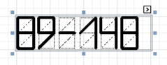
In the Property Grid, the Zip Code's properties are divided into the following groups.
Appearance
Background Color
Specifies the background color for the control. This option is also available in the Formatting Toolbar.
Borders, Border Color and Border Width
Specify border settings for the control.
Foreground Color
Specifies the color for the control. This option is also available in the Formatting Toolbar.
Formatting Rules
Invokes the Formatting Rules Editor allowing you to choose which rules should be applied to the control during report generation, and define the precedence of the applied rules. To learn more on this, refer to Conditionally Change a Control's Appearance.
Padding
Specifies indent values which are used to render the contents of the control.
Style Priority
Allows you to define the priority of various style elements (such as background color, border color, etc.). For more information on style inheritance, refer to Understand Styles Concepts.
Styles
This property allows you to define odd and even styles for the control, as well as to assign an existing style to the control (or a newly created one). For more information on style inheritance, refer to Understand Styles Concepts.
Behavior
Anchor Vertically
Specifies the vertical anchoring style of the control, so that after page rendering it stays attached to the top control, bottom control, or both.
Keep Together
Specifies whether the contents of the control can be horizontally split across pages. In other words, if the control occupies more space than remains on the page, this property specifies whether this Zip Code should be split between the current page and the next, or whether it will be printed entirely on the next page. This property is in effect only when a Zip Code's content does not fit on the current page. If it does not fit on the next page either, then the Zip Code will be split despite this property's value.
Scripts
This property contains events, which you can handle with the required scripts. For more information on scripting, refer to Handle Events via Scripts.
Segment Width
This property setting specifies the width of the lines (in pixels) used to draw the numbers in the zip boxes of the control.
Visible
Specifies whether the control should be visible in print preview.
Data
(Data Bindings)
If the current report is bound to data, this property allows you to bind some of the control's properties (Bookmark, Navigation URL, Tag and Text) to a data field obtained from the report's data source, and to apply a format string to it. For more information on this, refer to Display Values from a Database (Bind Report Elements to Data).
Tag
This property allows you to add some additional information to the control; for example its id, by which it can be then accessible via scripts.
If the current report has a data source, the Tag property can be bound to a data field obtained from the data source. To do this, expand the (Data Bindings) property, and in the Tag. Binding drop-down selector, select the required data field.
Text
The Text box should contain digits or dashes. Other characters are displayed as empty zip boxes. If the current report has a data source, the Text property can be bound to a data field obtained from the data source. To do this, expand the (Data Bindings) property, and in the Text. Binding drop-down selector, select the required data field. For more information on this, refer to Display Values from a Database (Bind Report Elements to Data).
|
Design |
(Name) Determines a control's name, by which it can be accessed in the Report Explorer, Property Grid or via scripts. |
|
Layout |
Location Specifies the control's location, in report measurement units. Size Specifies the control's size, in report measurement units. Snap Line Margin Specifies the margin (in report measurement units), which is to be preserved around the control when it is aligned using Snap Lines, or when other controls are aligned next to it. |
Navigation
Bookmark and Parent Bookmark
These properties are intended for the creation of a hierarchical structure within a report called a document map. For an explanation and help, refer to Add Bookmarks.
If the current report has a data source, the Bookmark property can be bound to a data field obtained from the data source. To do this, expand the (Data Bindings) property, and in the Bookmark. Binding drop-down selector, select the required data field.
Navigation URL and Navigation Target
Use the Navigation URL property to specify a URL for web browser navigation when a user clicks the control. The web browser displays a page in a window or a frame as specified by the Navigation Target property. Note that a URL should have an appropriate prefix (e.g. "http://"). You can create cross-
references within the report by assigning the name of the target control to the Navigation URL property, and setting the Navigation Target property to "_self". For more information, refer to Create Hyperlinks.
If the current report has a data source, the Navigation URL property can be bound to a data field obtained from the data source. To do this, expand the (Data Bindings) property, and in the Navigation URL. Binding drop-down selector, select the required data field.
The Chart is a sophisticated control used to embed graphs into your report. It graphically represents a series of points using numerous 2D or 3D chart types. A Chart can be populated with points both manually (by specifying arguments and values for each point) and dynamically (by connecting it to the report's data source, or binding it to a separate one).
For more information about this control, refer to Charting.
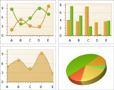
There are many available Chart types you can choose from. To name a few, these are Bar, Point, Line, Pie and Doughnut, Area, Radar and Polar, Range Bar, Gantt, Candle Stick and Stock charts.
A Chart control contains multiple elements (diagram, series, series points, axes, legend, titles, labels, strips, constant lines, etc.). When any of these elements is selected, the Property Grid shows only the properties which correspond to the selected item. Visual Chart elements which can be highlighted or selected, are described in Highlighting and Selection Chart Elements.
The Chart control is data-aware in a different manner than the other report controls. Consider three common report scenarios:
1.Static data for a Chart's series is provided manually. It can be done using the Series Collection Editor invoked by the Chart's Series property. It allows you to manually define values and arguments for each series point.
2.Chart's series are created automatically, getting their data from the Chart's Data Source and dependent on the rules defined by the Series Template property. This approach is described in Chart with Dynamic Series.
3.Each series is created and customized manually and has a separate Data Source. This approach is described in Chart with Static Series.
You can customize a created chart using both the Property Grid and the Chart Wizard. To invoke the Chart Wizard, click a Chart's Smart Tag, and in the invoked actions list, click the Run Wizard... link.
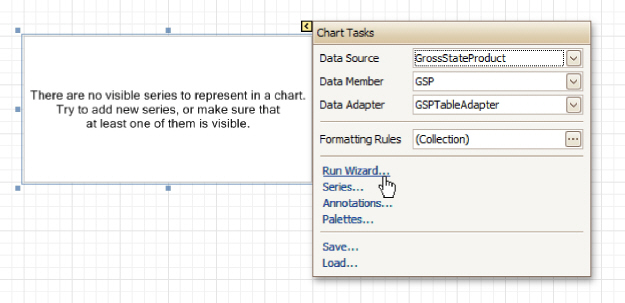
Then, the Chart Wizard will guide you through the whole process of customizing the Chart, from defining its view type to providing its data and customizing its appearance.
In the Property Grid, the Chart's properties are divided into the following groups.
Appearance
Appearance Name
Allows you to choose one of the available appearances, to be used to draw the Chart's elements (Diagram, Axes, Legend, etc.).
Background Color
Specifies the background color for a Chart.
Background Image
Allows you to load a background image to a Chart (or define its URL), and also define whether it should be stretched to fit the entire Chart's area, or not.
Borders, Border Color and Border Width
Specify border settings for the control.
Fill Style
Determines the fill style of a Chart's background (Empty, Solid, Gradient or Hatch) and define other fill options if required.
Formatting Rules
Invokes the Formatting Rules Editor allowing you to choose which rules should be applied to the control during report generation, and define the precedence of the applied rules. To learn more on this, refer to Conditionally Change a Control's Appearance.
Image Type
Determines whether a Chart should be internally rendered as a metafile in a report (in this case the quality of the rendered image is always good, but in particular cases some details of the control may be lost), or as a bitmap (in this case the quality of the rendered image is sometimes poor, but it allows a control to be drawn more precisely).
Indicators Palette Name
Specifies the palette that is used to paint all indicators that exist in a Chart.
Padding
Specifies the internal space between the Chart's content (the diagram and legend) and its edge, in pixels.
Palette Name
Allows you to choose one from the built-in palettes to be used to draw a Chart's series.
Palette's Base Color Number
Allows you to define an integer index determining the base color for the palette defined by the Chart's Palette Name property.
Style Priority
Allows you to define the priority of various style elements (such as background color, border color, etc.). For more information on style inheritance, refer to Understand Styles Concepts.
Behavior
Anchor Vertically
Specifies the vertical anchoring style of the control, so that after page rendering it stays attached to the top control, bottom control, or both.
Automatic Binding Settings Enabled
Specifies whether or not the Chart's data binding is automatically adjusted when its data source is a Pivot Grid.
Automatic Layout Settings Enabled
Specifies whether or not the Chart's layout is automatically adjusted when its data source is a Pivot Grid.
Empty Chart Text
Specifies the text to be shown in the Chart, when it has no data to display.
Scripts
This property contains events, which you can handle by the required scripts. For more information on scripting, refer to Handle Events via Scripts.
Small Chart Text
Specifies the text to be shown in the Chart, when it's too small to fit the diagram.
Visible
Specifies whether a Chart should be visible in print preview.
Data
(Data Bindings)
If the current report is bound to data, this property allows you to bind some of a Chart's properties (Bookmark, Navigation URL and Tag) to a data field obtained from the report's data source, and to apply a format string to it. For more information on this, refer to Display Values from a Database (Bind Report Elements to Data).
Data Adapter
Determines a data adapter that will populate a Chart's data source which is assigned via the Data Source property. It is automatically set to the appropriate value, when the Data Member property is defined. To learn more on this, refer to Chart with Static Series.
Data Member
Determines the data source member which supplies data to a Chart. To learn more on this, refer to Chart with Static Series.
 Note
Note
Usually, it is not necessary to specify the Data Member property when binding a Chart to data. This property should only be set directly if the dataset contains more than one table.
Data Source
Determines a Chart's data source. To learn more on this, refer to Chart with Static Series.
Pivot Grid Data Source Options
Determines a Chart's data source. To learn more on this, refer to Chart with Static Series.
Series Data Member
Determines the name of the data field whose values are used to automatically generate and populate a Chart's series. To learn more on this, refer to Chart with Dynamic Series.
When Chart binding is used to automatically generate series within a chart control based upon the data obtained from the associated data source (defined by the Data Source property), a rule needs to be defined that helps the Chart recognize the data records whose values are used to construct individual series objects. To do this, the Series Data Member property, which specifies the data field whose values are taken into account when series objects are automatically created and populated, can be used. Each automatically generated series gets its name from the data field specified by the Series Data Member property. For example, this name is used to identify a series within the chart control's legend. The names of all automatically generated series can be supplemented with the same prefix and postfix defined by the settings which are available via the Series Name Template property.
The template settings for the dynamically created series are defined by the specific properties which are available via the SeriesTemplate property of a Chart. In particular, the Argument Data Member and Value Data Members properties specify the data fields from which the arguments and data values of the series data points are obtained.
 Note
Note
Note that if the Series Data Member property is not set for a Chart, the Chart control can't automatically generate series even if the Argument Data Member and Value Data Members properties are defined.
Series Name Template
Determines the settings used to name data bound series defining the prefix and postfix texts for the names of series which are dynamically created as a result of binding a Chart to data (using the Data Source, Series Data Member, Argument Data Member and Value Data Members properties). The series names, to which these prefixes and postfixes are added, are taken by each series from the data field defined by the Series Data Member property. To learn more on this, refer to Chart with Dynamic Series.
 Note
Note
Note that the settings available via the Series Name Template property are not applied to the data bound series which are contained within the Series collection of a Chart.
Series Sorting
Allows you to define the sort mode of a Chart's series (None by default, Descending or Ascending).
Series Template
Allows you to customize a template for series which are created dynamically as a result of binding a Chart to data (via the Data Source and Series Data Member properties). The settings which are available via the Series Template property are common to all such data bound series. These settings allow you to provide centralized customization of all dynamically created data bound series. To learn more on using this
property, refer to Chart with Dynamic Series.
Note that the settings which are customized via the Series Template property don't apply to the series contained within the Series collection of a Chart.
Tag
This property allows you to add some additional information to the control; for example its id, by which it can then be accessible via scripts.
If the current report has a data source, the Tag property can be bound to a data field obtained from the data source. To do this, expand the (Data Bindings) property and in the Tag.Binding drop-down selector, select the required data field.
Design
(Name)
Determines a control's name, by which it can be accessed in the Report Explorer, Property Grid or via scripts.
Elements
Annotation Repository
Provides centralized access to all annotations that are present in the Chart.
Annotations
Provides access to the annotations collection of the Chart.
Diagram
Allows you to customize a Chart's diagram elements: main and secondary axes and panes.
By default, a Chart is displayed in the Default Pane, but if necessary, you can display each Chart's series in a separate pane. To do this, click the Pane's ellipsis button, to invoke the Pane Collection Editor,
allowing you to manage and customize panes. Then, select the required series within the Chart and set its View.Pane property to the required pane.
Note that the diagram is null until no visible series exists in the Chart's collection. So, to access the diagram's options, you should create a series first.
Legend
Allows you to customize a Chart's legend, by defining such properties as text alignment and antialiasing, font style, background color or image, border options, markers' size and visibility, shadow options, etc.
Series
Invokes the Series Collection Editor, which allows you to manage and customize a Chart's series. Note that series which are bound to data at the level of a chart control (in particular, using the Data Source, Series Data Member and both the Argument Data Member and Value Data Members properties) are created dynamically, based upon the data obtained from the specified data source, and they are not presented within the Series collection. To perform a centralized customization of such series, use the settings which are available via the Series Template property.
Titles
Invokes the Chart Title Collection Editor, which allows you to manage and customize a Chart's titles.
Layout
Location
Specifies the control's location, in report measurement units.
Size
Specifies the control's size, in report measurement units.
Snap Line Margin
Specifies the margin (in report measurement units), which is to be preserved around the control when it is aligned using Snap Lines, or when other controls are aligned next to it.
Navigation
Bookmark and Parent Bookmark
These properties are intended for the creation of a hierarchical structure within a report called a document map. For an explanation and help, refer to Add Bookmarks.
If the current report has a data source, the Bookmark property can be bound to a data field obtained from the data source. To do this, expand the (Data Bindings) property and in the Bookmark. Binding drop-down selector, select the required data field.
Navigation URL and Navigation Target
Use the Navigation URL property to specify a URL for web browser navigation when a user clicks the control. The web browser displays a page in a window or a frame as specified by the Navigation Target property. Note that a URL should have an appropriate prefix (e.g. "http://"). You can create cross-
references within the report by assigning the name of the target control to the Navigation URL property, and setting the Navigation Target property to "_self". For more information, refer to Create Hyperlinks. If the current report has a data source, the Navigation URL property can be bound to a data field obtained from the data source. To do this, expand the (Data Bindings) property, and in the Navigation URL. Binding drop-down selector, select the required data field.
The Pivot Grid control represents dynamic data (obtained from an underlying data source) in a cross-tabulated form to create cross-tab reports, similar to Pivot Tables in Microsoft Excel. Column headers display unique values from one data field, and row headers - from another field. Each cell displays a summary for the corresponding row and column values. By specifying different data fields, you can see different totals. This allows you to get a compact layout for a complex data analysis.
The Pivot Grid has a designer which allows you to easily adjust its layout. It can be invoked using the control's Smart Tag.
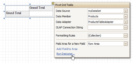
In the Property Grid, the Pivot Grid's properties are divided into the following groups.
Appearance
Appearance
Allows you to define the appearance properties (such as Background Color, Foreground Color, Font, etc.) for the Pivot Grid's elements (Cell, Field Value, Filter Separator, Header Group Line, etc.).
Formatting Rules
Invokes the Formatting Rules Editor allowing you to choose which rules should be applied to the control during report generation, and define the precedence of the applied rules. To learn more on this, refer to Conditionally Change a Control's Appearance.
Styles
Allows you to invoke the Styles Editor, which is intended to manage and customize the control's styles, which then can be assigned to the Pivot Grid's elements.
Behavior
Anchor Vertically
Specifies the vertical anchoring style of the Pivot Grid, so that after page rendering it stays attached to the top control, bottom control, or both.
Keep Together
Specifies whether the contents of the control can be horizontally split across pages. In other words, if the control occupies more space than remains on the page, this property specifies whether this Pivot Grid
should be split between the current page and the next, or whether it will be printed entirely on the next page. This property is in effect only when a Pivot Grid's content does not fit on the current page. If it does not fit on the next page either, then the Pivot Grid will be split despite this property's value.
Scripts
This property contains events, which you can handle by the required scripts. For more information on scripting, refer to Handle Events via Scripts.
Visible
Specifies whether the control should be visible in print preview.
Data
Data Adapter
Determines a data adapter that will populate a Pivot Grid's data source which is assigned via the Data Source property. It is automatically set to the appropriate value, when the Data Member property is defined. To learn more on this, refer to Cross-Tab Report.
Data Member
Determines the data source member which supplies data to a Pivot Grid. To learn more on this, refer to Cross-Tab Report.
 Note
Note
Usually, it is not necessary to specify the Data Member property when binding a Pivot Grid to data. This property should only be set directly if the dataset contains more than one table.
Data Source
Determines a Pivot Grid's data source. To learn more on this, refer to Cross-Tab Report.
Fields
Invokes the Pivot Grid Field Collection Editor, allowing you to manage and fully customize a Pivot Grid's fields.
OLAP Connection String
Specifies a connection string to a cube in an Microsoft Analysis Services database. A sample connection string is shown below:
OLAPConnectionString="Provider=msolap;Data Source=localhost;Initial Catalog=Adventure Works DW;Cube Name=Adventure Works;Query Timeout=100;"
A connection string can be built via the Connection String Editor. To invoke it, click the ellipsis button for the OLAP Connection String property.
To represent information from the bound cube, create specific Pivot Grid fields, and bind them to the required fields in the data source.
If the OLAP Connection String property is set to a valid string, the value of the Data Source property is cleared. Setting the Data Source property to a valid object clears the OLAP Connection String property.
Prefilter
When this property is expanded in the Property Grid, you can set its Enabled property to Yes, and use the Criteria property to invoke the Pivot Grid Prefilter dialog.
This dialog allows you to build complex filter criteria with an unlimited number of filter conditions, combined by logical operators. It provides a set of logical operators that significantly simplify the process of creating filters for text, numeric and date-time fields.
 Note
Note
The Prefilter is not supported in OLAP mode.
|
Design |
(Name) Determines a control's name, by which it can be accessed in the Report Explorer, Property Grid or via scripts. |
|
Layout |
Location Specifies the control's location, in report measurement units. Size Specifies the control's size, in report measurement units. Snap Line Margin Specifies the margin (in report measurement units), which is to be preserved around the control when it is aligned using Snap Lines, or when other controls are aligned next to it. |
Navigation
Bookmark and Parent Bookmark
These properties are intended for the creation of a hierarchical structure within a report called a document map. For an explanation and help, refer to Add Bookmarks.
Options
Data Field Options
Allows you to customize the options which control the presentation of the data fields.
Data Options
Allows you to define whether a Pivot Grid's fields must be case sensitive or not.
Options Chart Data Source
Provides access to the options controlling the display of the Pivot Grid's data in a Chart.
Print Options
Allows you to customize the print options of a Pivot Grid.
View Options
Allows you to customize the Pivot Grid's display options.
The Page Info control is intended to add page numbers and system information (the current date and time or the current user name) into your report. As with many other controls, you can format this control's content.
In the Property Grid, the Page Info control's properties are divided into the following groups.
Appearance
Background Color
Specifies the background color for the control. This option is also available in the Formatting Toolbar.
Borders, Border Color and Border Width
Specify border settings for the control.
Font
Specifies the font settings for the control. Some of these settings are available in the Formatting Toolbar.
Foreground Color
Specifies the text color for the control. This option is also available in the Formatting Toolbar.
Formatting Rules
Invokes the Formatting Rules Editor, allowing you to choose which rules should be applied to the control during report generation, and define the precedence of the applied rules. To learn more on this, refer to Conditionally Change a Control's Appearance.
Padding
Specifies indent values which are used to render the contents of the control.
Style Priority
Allows you to define the priority of various style elements (such as background color, border color, etc.). For more information on style inheritance, refer to Understand Styles Concepts.
Styles
This property allows you to define odd and even styles for the control, as well as to assign an existing style to the control (or a newly created one). For more information on style inheritance, refer to Understand Styles Concepts.
Text Alignment
Allows you to change the alignment of the control's text. This option is also available in the Formatting Toolbar.
Behavior
Anchor Vertically
Specifies the vertical anchoring style of the control, so that after page rendering it stays attached to the top control, bottom control, or both.
Format
This property allows you to specify the format string for the text displayed in the control. When you click the ellipsis button, you will see the Format String Editor window that will select the predefined format or customize it as needed. For more information about this, refer to Change Value Formatting of Report Elements.
Page Information
You can select the type of information displayed in the control.
|
Type |
Descriptoin |
|
None |
Displays an empty control. |
|
Page Number |
The string, specified by the Format property, is displayed. The {0} combination in the string is replaced with the current page number. |
|
"Current of Total" Page Numbers |
The string, specified by the Format property, is displayed. The {0} combination in the string is replaced with the current page number, the {1} combination - with a total number of pages in the report. To display the typical "Page 1 of 11" text, use the format string "Page {0} of {1}". |
|
Page Number (Roman, Lowercase) |
The current page number is displayed using Roman numerals in lowercase. |
|
Page Number (Roman, Uppercase) |
The current page number is displayed using Roman numerals in uppercase. |
|
Current Date and Time |
The string, specified by the Format property, is displayed. The {0:[format]} combination is replaced with the current system date and time formatted according to the [format] string. Use the Format String Editor of the Format property (see below) to select or construct the proper string. |
|
User Name |
The name of the current user, which was used to log into the operating system, is displayed. |
Running Band
Specifies the name of the band, from which the Page Info gathers information. This allows you to implement page numbering independently for the report and its groups. For a tutorial on this, refer to Add Page Numbers for Groups.
By default, this property is not set to any value, meaning that the entire report is being taken into account.
Scripts
This property contains events, which you can handle with the required scripts. For more information on scripting, refer to Handle Events via Scripts.
Start Page Number
Here you can set the start number for page numbering.
Visible
Specifies whether the control should be visible in print preview.
Word Wrap
When this property is set to Yes, text contained in the control is wrapped to the next line if it doesn't fit the line or comes across a newline character. If the this property is set to No, the text in this case will be displayed on the same line until a newline character is entered.
Data
(Data Bindings)
If the current report is bound to data, this property allows you to bind some of the control's properties (Bookmark, Navigation URL and Tag) to a data field obtained from the report's data source, and to apply a format string to it. For more information on this, refer to Display Values from a Database (Bind Report Elements to Data).
Tag
This property allows you to add some additional information to the control; for example its id, by which it can be then accessible via scripts.
If the current report has a data source, the Tag property can be bound to a data field obtained from the data source. To do this, expand the (Data Bindings) property and in the Tag. Binding drop-down selector, select the required data field.
|
Design |
(Name) Determines a control's name, by which it can be accessed in the Report Explorer, Property Grid or via scripts. |
|
Layout |
Location Specifies the control's location, in report measurement units. Size Specifies the control's size, in report measurement units. Snap Line Margin Specifies the margin (in report measurement units), which is to be preserved around the control when it is aligned using Snap Lines, or when other controls are aligned next to it. |
Navigation
Bookmark and Parent Bookmark
These properties are intended for the creation of a hierarchical structure within a report called a document map. For an explanation and help, refer to Add Bookmarks.
If the current report has a data source, the Bookmark property can be bound to a data field obtained from the data source. To do this, expand the (Data Bindings) property and in the Bookmark. Binding drop-down selector, select the required data field.
Navigation URL and Navigation Target
Use the Navigation URL property to specify a URL for web browser navigation when a user clicks the control. The web browser displays a page in a window or a frame as specified by the Navigation Target property. Note that a URL should have an appropriate prefix (e.g. "http://"). You can create cross-
references within the report by assigning the name of the target control to the Navigation URL property, and setting the Navigation Target property to "_self". For more information, refer to Create Hyperlinks.
If the current report has a data source, the Navigation URL property can be bound to a data field obtained from the data source. To do this, expand the (Data Bindings) property and in the Navigation URL. Binding drop-down selector, select the required data field.
The Page Break control's sole purpose is to insert a page delimiter at any point within a report.
This control is visually represented by a short line, attached to the report's left margin, as shown in the following image.
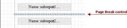
The Page Break control is useful when you need to insert a page break between controls within a band - for example, to divide subreports, so that the second subreport starts printing on a new page. Another example of the Page Break's use can be found in the following tutorial: Limit the Number of Records per Page.
 Note
Note
Note that when you need a page break before or after printing a certain band, you may set its Page Break property to Before the Band or After the Band, instead of using the Page Break control.
In the Property Grid, the Page Break control's properties are divided into the following groups.
Appearance
Formatting Rules
Invokes the Formatting Rules Editor, allowing you to choose which rules should be applied to the control during report generation, and define the precedence of the applied rules. To learn more on this, refer to Conditionally Change a Control's Appearance.
Behavior
Scripts
This property contains events, which you can handle with the required scripts. For more information on scripting, refer to Handle Events via Scripts.
Visible
Specifies whether the control should be visible in print preview.
|
Design |
(Name) Determines a control's name, by which it can be accessed in the Report Explorer, Property Grid or via scripts. |
|
Layout |
Location Specifies the control's location, in report measurement units. Snap Line Margin Specifies the margin (in report measurement units), which is to be preserved around the control when it is aligned using Snap Lines, or when other controls are aligned next to it. |
The Cross-band Line control allows you to draw a line through several bands. This can be useful if it is required to visually emphasize a section consisting of multiple band areas.
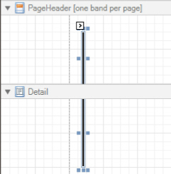
In other aspects, it is similar to a regular Line.
Another cross-band control available is the Cross-band Box.
In the Property Grid, the Cross-band Line control's properties are divided into the following groups.
Appearance
Foreground Color
Specifies the color of the control's line. This option is also available in the Formatting Toolbar.
Formatting Rules
Invokes the Formatting Rules Editor allowing you to choose which rules should be applied to the control during report generation, and define the precedence of the applied rules. To learn more on this, refer to Conditionally Change a Control's Appearance.
Line Style
You can select a solid (by default), dashed, dotted or mixed style for the line.
Behavior
Anchor Vertically
Specifies the vertical anchoring style of the control, so that after page rendering it stays attached to the top control, bottom control, or both.
Visible
Specifies whether the control should be visible in print preview.
|
Data |
Tag This property allows you to add some additional information to the control; for example its id, by which it then can be accessible via scripts. |
|
Design |
(Name) Determines a control's name, by which it can be accessed in the Report Explorer, Property Grid or via scripts. |
|
Layout |
End Band Determines a band, in which the control finishes drawing. |
End Point
Determines the end point (from a band's upper left corner) where the control finishes drawing.
Location
Specifies the control's location, in report measurement units.
Snap Line Margin
Specifies the margin (in report measurement units), which is to be preserved around the control when it is aligned using Snap Lines, or when other controls are aligned next to it.
Start Band
Determines a band, in which the control starts drawing.
Start Point
Determines the starting point (from a band's upper left corner) where the control starts drawing.
Width
Specifies the line's width in report measurement units.
The Cross-band Box control allows you to draw a rectangle through several bands. This can be useful if it is required to visually encompass a section consisting of multiple band areas.
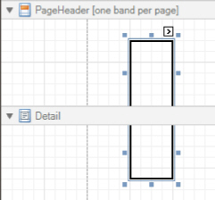
Another cross-band control available is the Cross-band Line.
In the Property Grid, the Cross-band Box control's properties are divided into the following groups.
Appearance
Borders, Border Color and Border Width
Specify border settings for the control.
Formatting Rules
Invokes the Formatting Rules Editor, allowing you to choose which rules should be applied to the control during report generation, and define the precedence of the applied rules. To learn more on this, refer to Conditionally Change a Control's Appearance.
Behavior
Anchor Vertically
Specifies the vertical anchoring style of the control, so that after page rendering it stays attached to the top control, bottom control, or both.
Visible
Specifies whether the control should be visible in print preview.
|
Data |
Tag This property allows you to add some additional information to the control; for example its id, by which it can then be accessible via scripts. |
|
Design |
(Name) Determines a control's name, by which it can be accessed in the Report Explorer, Property Grid or via scripts. |
|
Layout |
End Band Determines a band, in which the control finishes drawing. End Point Determines the end point (from a band's upper left corner) where the control finishes drawing. |
Location
Specifies the control's location, in report measurement units.
Snap Line Margin
Specifies the margin (in report measurement units), which is to be preserved around the control when it is aligned using Snap Lines, or when other controls are aligned next to it.
Start Band
Determines a band, in which the control starts drawing.
Start Point
Determines the starting point (from a band's upper left corner) where the control starts drawing.
Width
Specifies the width of the Box, in report measurement units.
The Subreport control allows you to include other reports in your current report.
There are several reasons for using subreports. The first one is to reuse reports. This can be of help if there is a particular report structure (template) that has to be included in all reports, and the report must have consistent appearance and functionality. A good example is a report header that contains the company information, logo, date, etc. The second reason for using subreports is creation of master-detail reports (or, invoice reports with hierarchically linked data).
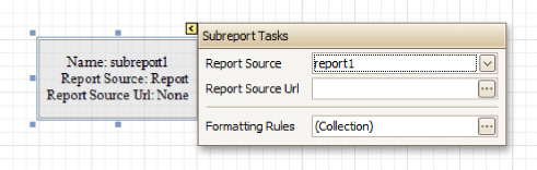
However, for master-detail reports creation, another approach is recommended: using Detail Report bands.
You can click a subreport, to open the report to which it is linked in a new Design Panel.
In the Property Grid, the Subreport's properties are divided into the following groups.
Appearance
Formatting Rules
Invokes the Formatting Rules Editor allowing you to choose which rules should be applied to the control during report generation, and define the precedence of the applied rules. To learn more on this, refer to Conditionally Change a Control's Appearance.
Behavior
Can Shrink
Determines whether a Subreport's height should be decreased if its contents don't completely fill the control.
Use this property to specify whether the height of the Subreport control should be taken into account when generating a report. This may be required, because usually the mutual location of report controls is considered when generating a report document. But, as the Subreport control actually represents a
report itself, the height of a Subreport normally should not be taken into account in the generated report document.
Also, note that there is no Can Grow option for the Subreport control, as it always increases its height depending on its contents.
Scripts
This property contains events, which you can handle by the required scripts. For more information on scripting, refer to Handle Events via Scripts.
Visible
Specifies a value indicating whether the current control should be printed (when set to Yes) or hidden (No) on report generation.
Data
Report Source
Determines a report to be included as a subreport.
If report classes of the application that invoked the Report Designer are compiled into one assembly, then they are available as items in this combo box.
Report Source Url
Defines an URL of a report definition file (*.REPX), to be used as a report source.