The documents in this section details the available kinds of report bands and their settings.
In the Report Designer, a report is built upon bands - sections of varied type and purpose, where report controls are contained. Bands are featured in the Designer Tab, solely to represent different sections of a report document (such as detail, report or page header, or footer). They allow you to select exactly where a control should be printed, and how many times.
Band Types
The following band types are available.
Manage Bands
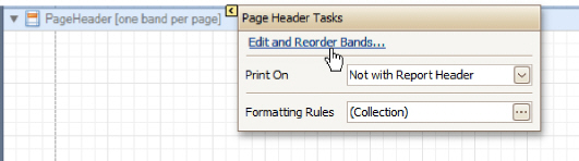
To manage bands in a report, click its Smart Tag, and in the invoked actions list, click the Edit and Reorder Bands... link.
Then, in the invoked Report Editor you can easily add, remove and reorder bands, and adjust their options.
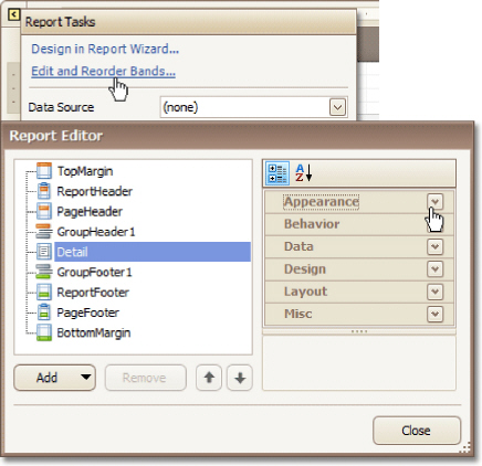
Alternatively, you can invoke the Report Editor via any band's Smart Tag.
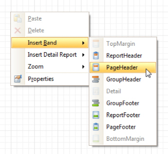
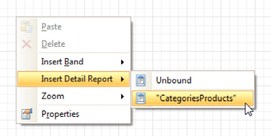
To quickly insert a band of any type (except for the Detail band, since it is required in a report), right-click anywhere on a report's surface, and in the invoked Context Menu, point to Insert Band, and choose the band type.
See Also
Detail Report Band for Master-Detail Reports
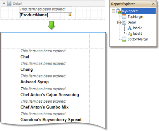
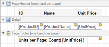
The Detail band is the central part of a report. Unlike other bands, it cannot be deleted - the present report structure includes the Detail band in its core. In a data-bound report, the contents of the Detail band are repeated for every data entry (e.g. if you're building a report listing, say, products, it will be rendered for each product in the database). And, if static data is also present in the Detail band, in the resulting report, it is repeated with each new entry.
In the Property Grid, the Detail Band's properties are divided into the following groups.
Appearance
Background Color
Specifies the background color for the controls contained within the band. This option is also available in the Formatting Toolbar.
Borders, Border Color and Border Width
Specify border settings for the controls contained within the band.
Font
Specifies the font settings for the controls contained within the band. Some of these settings are available in the Formatting Toolbar.
Foreground Color
Specifies the text color for the controls contained within the band. This option is also available in the Formatting Toolbar (  ).
).
Formatting Rules
Invokes the Formatting Rules Editor allowing you to choose which rules should be applied to the band during report generation, and define the precedence of the applied rules. To learn more on this, refer to Conditionally Change a Control's Appearance.
Padding
Specifies indent values which are used to render the contents of the controls contained within the band.
Style Priority
Allows you to define the priority of various style elements (such as background color, border color, etc.). For more information on style inheritance, refer to Understand Styles Concepts.
Styles
This property allows you to define odd and even styles for the controls contained within the band, as well as to assign an existing style to them (or a newly created one). For more information on style inheritance, refer to Understand Styles Concepts.
Text Alignment
Allows you to change the text alignment of the controls contained within the band. This option is also available in the Formatting Toolbar.
Behavior
Keep Together
As stated above, the detail band is printed repeatedly for every data entry. When the Keep Together option is on, the report engine tries to keep sequential detail band entries together. This option makes sense only when data is grouped or you're working with a master-detail report. In this case, the report engine tries to keep group contents on one page. If a group doesn't fit and it starts somewhere in the middle of a page, the report moves this group to a new page, thus trying to reduce the number of page breaks in continuous data.
Multi-Column Options
This property allows you to arrange the printout of the band's content in several columns. For more information, refer to Multi-Column Report.
Page Break
Use this property if the current report design requires that the detail section should be separated from previous sections or follow-ups. Specify the Before the Band or After the Band values to insert a page break before or after the current band. In many cases, this property may be used instead of the Page Break control.
Scripts
This property contains events, which you can handle by the required scripts. For more information on scripting, refer to Handle Events via Scripts.
Visible
Specifies whether the band should be visible in print preview.
|
Data |
Sort Fields Invokes the Group Field Collection Editor, which enables you to specify the fields for sorting the records within the band, the sorting order (Ascending/Descending) for each field and the order sequence. For more information, refer to Change or Apply Data Sorting to a Report. Tag This property allows you to add some additional information to the band; for example its id, by which it can then be accessible via scripts. |
|
Design |
(Name) Determines a band's name, by which it can be accessed in the Report Explorer, Property Grid or via scripts. |
|
Layout |
Height Specifies the band's height, in report measurement units. Snap Line Padding Specifies the padding (in report measurement units), which is to be preserved within the band when controls it contains are aligned using Snap Lines. |
Misc
Keep Together with Detail Reports
When this option is on, the Detail Band will be always printed on the same page together with its child Detail Report Band, or multiple bands.
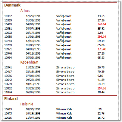
The Group Header and Group Footer bands are shown above and below each group. Usually, you don't need to manually manage these bands, as they are auto-created via the Group and Sort Panel. For more information, refer to Change or Apply Data Grouping to a Report and Change or Apply Data Sorting to a Report.
You may use the Group Header bands for grouping by multiple data fields in one of the following ways.
1.Add several Group Header bands. Specify one group field for each of these bands.
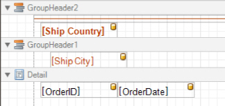
This results in nested grouping of the report's data.
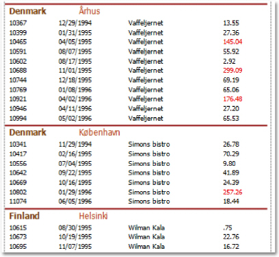
2.Specify several group fields for the Group Fields property of the Group Header band. The data will be grouped by certain combinations of field values.
The Group Footer band is unnecessary without the corresponding Group Header band, to which its properties are similar. The Group Footer can be used to display group totals, or group page numbers.
In the Property Grid, the properties of both these bands are divided into the following groups.
Appearance
Background Color
Specifies the background color for the controls contained within the band. This option is also available in the Formatting Toolbar.
Borders, Border Color and Border Width
Specify border settings for the controls contained within the band.
Font
Specifies the font settings for the controls contained within the band. Some of these settings are available in the Formatting Toolbar.
Foreground Color
Specifies the text color for the controls contained within the band. This option is also available in the Formatting Toolbar (  ).
).
Formatting Rules
Invokes the Formatting Rules Editor allowing you to choose which rules should be applied to the band during report generation, and define the precedence of the applied rules. To learn more on this, refer to Conditionally Change a Control's Appearance.
Padding
Specifies indent values which are used to render the contents of the controls contained within the bands.
Style Priority
Allows you to define the priority of various style elements (such as background color, border color, etc.). For more information on style inheritance, refer to Understand Styles Concepts.
Styles
This property allows you to define odd and even styles for the controls contained within the bands, as well as to assign an existing style to them (or a newly created one). For more information on style inheritance, refer to Understand Styles Concepts.
Text Alignment
Allows you to change the text alignment of the controls contained within the bands. This option is also available in the Formatting Toolbar.
Behavior
Group Fields
This property is available for the Group Header band only. It invokes the Group Field Collection Editor, allowing you to add and remove grouping fields, define data fields to be used as grouping criteria and the grouping order (ascending or descending).
In most scenarios, it's quick and practical to use the Group and Sort Panel, rather than manually adjust the band's group fields collection. However, this is the only way to assign multiple group fields to a single Group Header.
Group Union
Determines whether group rows can be printed on different pages (in this case both Group Union and Group Footer Band.Group Union are set to None), or the entire group will be printed on a single page (if the Group Union is set to Whole Page).
Also, if a group can be split across pages, but you don't want a Group Header to be printed on a page if there is no data row below it (in case a group starts at the bottom of the page and there is enough room for only a Group Header), you may set the Group Union to With First Detail. In this case, if a Group Header is alone on a page, it will be moved to the beginning of the next page.
It is the same for the Group Footer. If you don't want it to be printed alone on a page, you may set its Group Union to With Last Detail, and the last group row from the previous page will be moved to the next page to be printed together with a Group Footer.
This property is quickly accessible via the band's Smart Tag.
Keep Together
When this option is on, the report tries to fit the band contents entirely on one page, not allowing it to split across several pages. In general, if the contents are too large to fit on a single page, then the band is started on a new page, and continues on the following page.
Level
Specifies the nesting level of a group band. The lower the level number, the closer the group band is to the Detail band. The numeration starts at zero. It is the parameter that identifies the Group Header / Group Footer band pairs.
This option is auto-defined when using the Group and Sort Panel.
Page Break
Use this property if the current report design requires that the band's section should be separated from previous sections or follow-ups. Specify the Before the Band or After the Band values to insert a page break before or after the current band. In many cases, this property may be used instead of the Page Break control.
Print at Bottom
This property is available for the Group Footer band only. It determines whether the band should be printed at the bottom of a page, or immediately after the last group's details.
If a report contains several Group Footers with their Print at Bottom properties set to different values, then the outer Group Footer has the highest priority.
This feature is helpful when the Page Break property of the Group Header band is set to After the Band. In this instance each group starts a new page, and the Group Footer has two distinct places to reside -after the last row, or at the bottom of the page.
Repeat Every Page
This property improves the readability of reports with group contents that are several pages long. Without a repeated group header at the top of the page, the report may be difficult to read.
This property is also accessible via the band's Smart Tag.
Scripts
This property contains events, which you can handle with the required scripts. For more information on scripting, refer to Handle Events via Scripts.
Sorting Summary
This property is available for the Group Header band only. It allows you to sort groups by a summary function result.
Visible
Specifies whether the bands should be visible in print preview.
Data
Tag
This property allows you to add some additional information to the band; for example its id, by which it can then be accessible via scripts.
Design
Name
Determines a band's name, by which it can be accessed in the Report Explorer, Property Grid or via scripts.
Layout
Height
Specifies the band's height, in report units.
Snap Line Padding
Specifies the padding (in report measurement units), which is to be preserved within the band when controls it contains are aligned using Snap Lines.
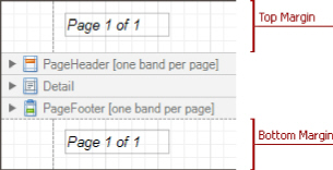
The Report Header and Report Footer are the only types of report bands rendered once per report.
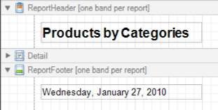
The Report Header is the first band of a report on the first page (not counting margins as they are "out-of-page" zones). The Report Header also precedes the Page Header, making it the best place to display the report's name, company logo, date of creation and user name, etc.
And, if you plan to add a Chart that visualizes the report's data, place this control onto this band.
The Report Footer finalizes the informative part of the report. It is placed before the Page Footer and Bottom Margin on the report's last page. Use the Report Footer for report grand totals or conclusions.
In the Property Grid, the properties of these bands are divided into the following groups.
Appearance
Background Color
Specifies the background color for the controls contained within the band. This option is also available in the Formatting Toolbar.
Borders, Border Color and Border Width
Specify border settings for the controls contained within the band.
Font
Specifies the font settings for the controls contained within the band. Some of these settings are available in the Formatting Toolbar.
Foreground Color
Specifies the text color for the controls contained within the band. This option is also available in the Formatting Toolbar ( ).
).
Formatting Rules
Invokes the Formatting Rules Editor allowing you to choose which rules should be applied to the band during report generation, and define the precedence of the applied rules. To learn more on this, refer to Conditionally Change a Control's Appearance.
Padding
Specifies indent values which are used to render the contents of the controls contained within the bands.
Style Priority
Allows you to define the priority of various style elements (such as background color, border color, etc.). For more information on style inheritance, refer to Understand Styles Concepts.
Styles
This property allows you to define odd and even styles for the controls contained within the bands, as well as to assign an existing style to them (or a newly created one). For more information on style inheritance, refer to Understand Styles Concepts.
Text Alignment
Allows you to change the text alignment of the controls contained within the bands. This option is also available in the Formatting Toolbar.
Behavior
Keep Together
When this option is on, the report tries to fit the band contents entirely on one page, not allowing it to split across several pages. In general, if the contents are too large to fit on a single page, then the band is started on a new page, and continues on the following page.
Page Break
Use this property if the current report design requires that the band's section should be separated from previous sections or follow-ups. Specify the Before the Band or After the Band values to insert a page break before or after the current band. In many cases, this property may be used instead of the Page Break control.
Print at Bottom
This property is available for the Report Footer band only, and determines whether this band should be printed at the bottom of the last page, or immediately after the last report's details. The Report Footer has priority over the Group Footer's Print at Bottom property, so the Group Footer can never be placed after the Report Footer.
Scripts
This property contains events, which you can handle with the required scripts. For more information on scripting, refer to Handle Events via Scripts.
Visible
Specifies whether the band should be visible in print preview.
Data
Tag
This property allows you to add some additional information to the band; for example its id, by which it can then be accessible via scripts.
Design
Name
Determines a band's name, by which it can be accessed in the Report Explorer, Property Grid or via scripts.
Layout
Height
Specifies the band's height, in report units.
Snap Line Padding
Specifies the padding (in report measurement units), which is to be preserved within the band when controls it contains are aligned using Snap Lines.
Misc
Print On
This property specifies whether the band should be printed on the same page with Report Header and Report Footer.
The Page Header and Page Footer bands are located at the top and bottom of every page in a report.
The Page Header/Footer bands are the best place for information that should be printed on every page. For example, use them to display the header of a table which is continued from the previous page (an example can be found at the Table Report tutorial).
 Note
Note
If you insert page break right after the Report Header (by setting its Page Break to After the Band), the Page Footer and Page Header bands will not be printed on the first page.
In the Property Grid, the properties of these bands are divided into the following groups.
Appearance
Background Color
Specifies the background color for the controls contained within the band. This option is also available in the Formatting Toolbar.
Borders, Border Color and Border Width
Specify border settings for the controls contained within the band.
Font
Specifies the font settings for the controls contained within the band. Some of these settings are available in the Formatting Toolbar.
Foreground Color
Specifies the text color for the controls contained within the band. This option is also available in the Formatting Toolbar ( ).
).
Formatting Rules
Invokes the Formatting Rules Editor, allowing you to choose which rules should be applied to the band during report generation, and define the precedence of the applied rules. To learn more on this, refer to Conditionally Change a Control's Appearance.
Padding
Specifies indent values which are used to render the contents of the controls contained within the bands.
Style Priority
Allows you to define the priority of various style elements (such as background color, border color, etc.). For more information on style inheritance, refer to Understand Styles Concepts.
Styles
This property allows you to define odd and even styles for the controls contained within the bands, as well as to assign an existing style to them (or a newly created one). For more information on style inheritance, refer to Understand Styles Concepts.
Text Alignment
Allows you to change the text alignment of the controls contained within the bands. This option is also available in the Formatting Toolbar.
Behavior
Scripts
This property contains events, which you can handle with the required scripts. For more information on scripting, refer to Handle Events via Scripts.
Visible
Specifies whether the band should be visible in print preview.
Data
Tag
This property allows you to add some additional information to the band; for example its id, by which it can then be accessible via scripts.
Design
Name
Determines a band's name, by which it can be accessed in the Report Explorer, Property Grid or via scripts.
Layout
Height
Specifies the band's height, in report units.
Snap Line Padding
Specifies the padding (in report measurement units), which is to be preserved within the band when controls it contains are aligned using Snap Lines.
Misc
Print On
This property specifies whether the band should be printed on the same page with Report Header and Report Footer bands.
The Top Margin and Bottom Margin bands represent the top and bottom page margins. Unlike other bands, they are not accompanied by strips displaying their titles in the Design Panel.
They are intended for displaying page numbers, or some sort of supplementary information (e.g. current system time or the user name).
In the Property Grid, the properties of these bands are divided into the following groups.
Appearance
Background Color
Specifies the background color for the controls contained within the band. This option is also available in the Formatting Toolbar ( ).
Borders, Border Color and Border Width
Specify border settings for the controls contained within the band.
Font
Specifies the font settings for the controls contained within the band. Some of these settings are available in the Formatting Toolbar.
Foreground Color
Specifies the text color for the controls contained within the band. This option is also available in the Formatting Toolbar ( ).
).
Formatting Rules
Invokes the Formatting Rules Editor allowing you to choose which rules should be applied to the band during report generation, and define the precedence of the applied rules. To learn more on this, refer to Conditionally Change a Control's Appearance.
Padding
Specifies indent values which are used to render the contents of the the controls contained within the bands.
Style Priority
Allows you to define the priority of various style elements (such as background color, border color, etc.). For more information on style inheritance, refer to Understand Styles Concepts.
Styles
This property allows you to define odd and even styles for the controls contained within the bands, as well as to assign an existing style to them (or a newly created one). For more information on style inheritance, refer to Understand Styles Concepts.
Text Alignment
Allows you to change the text alignment of the controls contained within the bands. This option is also available in the Formatting Toolbar.
Behavior
Scripts
This property contains events, which you can handle with the required scripts. For more information on scripting, refer to Handle Events via Scripts.
Visible
Specifies whether the band should be visible in print preview.
|
Data |
Tag This property allows you to add some additional information to the band; for example its id, by which it can then be accessible via scripts. |
|
Design |
(Name) Determines a band's name, by which it can be accessed in the Report Explorer, Property Grid or via scripts . |
Layout
Height
Specifies the band's height, in report units.
 Note
Note
Note that this property is tied to the report's Margins. Top (or Margins.Bottom) property, so that changing this property's value will cause the appropriate Margin value to be changed, and vice versa.
Snap Line Padding
Specifies the padding (in report measurement units), which is to be preserved within the band when controls it contains are aligned using Snap Lines.
Detail Report Band for Master-Detail Reports
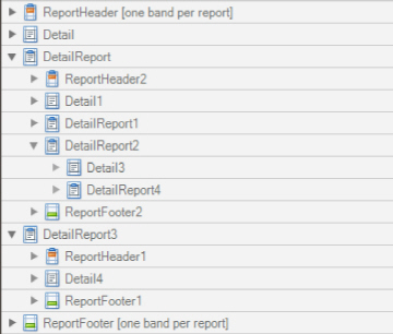
The Detail Report band is a type of band used to incorporate one report into another in master-detail reports. It is quite different from the Detail band, since it holds the whole detail report in a master-detail report layout, and therefore can contain other types of bands within it.
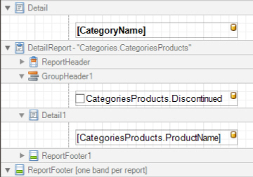
There can be an unlimited number of Detail Report bands nested inside one another.
To add a Detail Report band, use the Context Menu. If the bound data source contains a data relationship, the submenu will contain an item with its name. Otherwise, add an unbound detail report and specify its data binding options later.
In the Property Grid, the properties of this band are divided into the following groups.
Appearance
Background Color
Specifies the background color for the controls contained within the band. This option is also available in the Formatting Toolbar.
Borders, Border Color and Border Width
Specify border settings for the controls contained within the band.
Font
Specifies the font settings for the controls contained within the band. Some of these settings are available in the Formatting Toolbar.
Foreground Color
Specifies the text color for the controls contained within the band. This option is also available in the Formatting Toolbar ( ).
).
Formatting Rules
Invokes the Formatting Rules Editor, allowing you to choose which rules should be applied to the band during report generation, and define the precedence of the applied rules. To learn more on this, refer to Conditionally Change a Control's Appearance.
Padding
Specifies indent values which are used to render the contents of the controls contained within the band.
Text Alignment
Allows you to change the text alignment of the controls contained within the band. This option is also available in the Formatting Toolbar.
Behavior
Level
Specifies the order of several Detail Report Band objects in a report. It allows the reordering of different Detail Report Bands at the same level of master-detail relationships. The lower the level number, the closer the band is to the Detail band.
Page Break
Use this property if the current report design requires that the band's section should be separated from previous sections or follow-ups. Specify the Before the Band or After the Band values to insert a page break before or after the current band. In many cases, this property may be used instead of the Page Break control.
Print when Data Source is Empty
Specifies whether the band should be printed if its data source is empty.
Scripts
This property contains events which you can handle with the required scripts. For more information on scripting, refer to Handle Events via Scripts.
Visible
Specifies whether the band should be visible in print preview.
Data
Data Adapter
Determines a Detail Report Band's data adapter that provides the detail data for the report. To learn more, refer to Master-Detail Report (Detail Report Bands).
Data Member
Determines a name of the data relationship established within the bound data source. To learn more, refer to Master-Detail Report (Detail Report Bands).
Data Source
Determines the data source that provides the detail data for the report. If this property isn't defined, the detail report gets data from the master report's data source. To learn more, refer to Master-Detail Report (Detail Report Bands).
Filter String
Allows you to invoke the Filter String Editor, which is intended to easily define a filtering condition for a detail report's data. For more information, refer to Change or Apply Data Filtering to a Report.
Tag
This property allows you to add some additional information to the band; for example its id, by which it can then be accessible via scripts.
XML Data Path
Allows you to define a path to the data contained in an XML file. The data contained in the file will then be used as the Detail Report Band's data source.
In this case, the Data Member property will specify the bound list in the XML data source.
 Note
Note
Note that a detail report uses the XML Data Path property value only when the Data Source property is set to None. The XML Data Path property has a lower priority than the Data Source property.
Design
(Name)
Determines a band's name, by which it can be accessed in the Report Explorer, Property Grid or via scripts .
Detail Print Count
Specifies how many times the Detail band should be printed when a data source is defined for the subreport, and it is not empty.
Detail Print Count when Data Source is Empty
Specifies how many times the Detail band should be printed when no data source is defined for the subreport.
Structure
Bands
Allows you to invoke the Report Editor intended to manage and customize the report's bands.