The documents in this section are dedicated to the elements of the Report Designer user interface.
The following topics describe the Report Designer interface.
Report Designer Interface
General Elements
Quick Access Tools
Toolbars
Dock Panels
Tabs
Additional Elements
This document describes elements that comprise the Ribbon Report Designer.
The following image illustrates a Ribbon Designer.
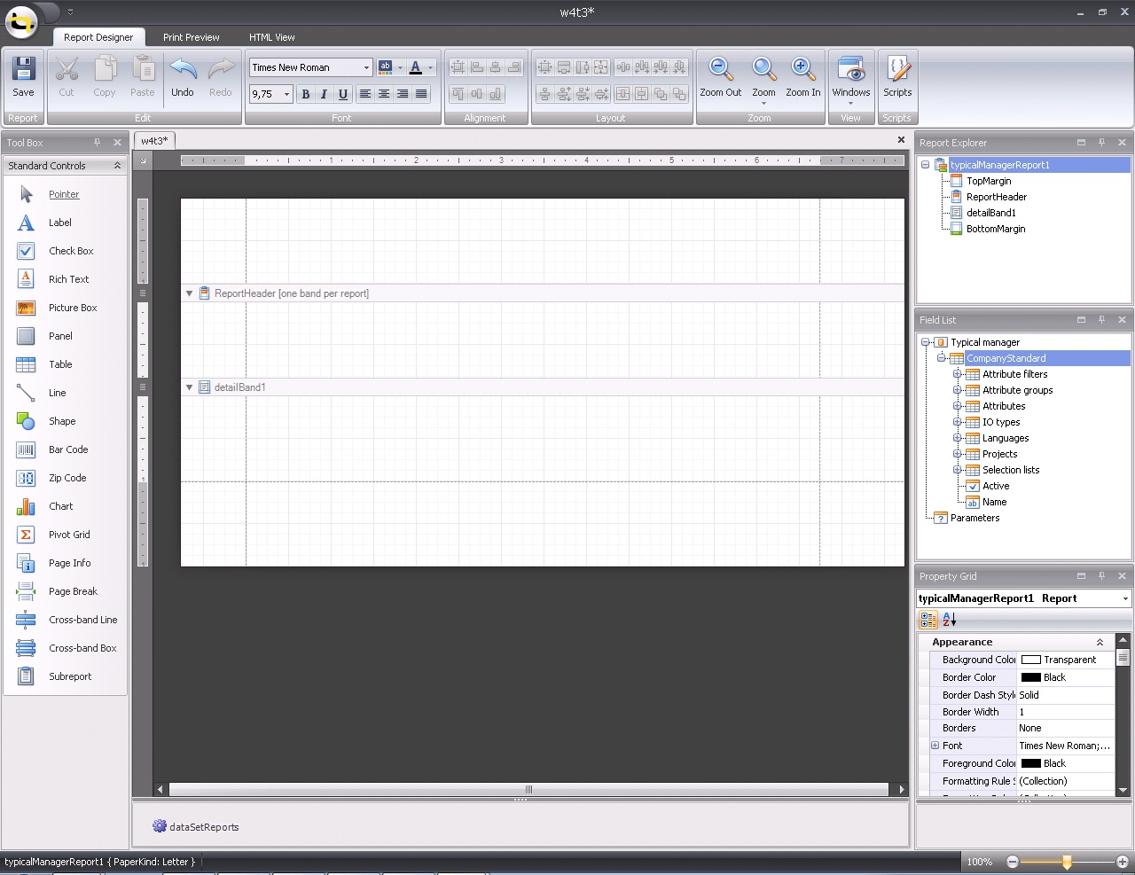
The following table lists all the main interface elements of the Ribbon Designer.
|
Element |
Description |
|
Ribbon |
The main toolbar in the Designer that contains the Main, Formatting, Layout and Zoom toolbars, as well as the Scripts Tab button. |
|
Contains controls that you can add to your report by dragging and dropping its icons onto a report's area. |
|
|
Main Tabs |
Allows you to switch between the Designer, Preview and HTML View tabs. |
|
MDI Controller |
Provides the multi-document interface in the Designer by containing its Design Panels. |
|
A surface where a report is being edited. The Designer provides a multi-document interface, and can have as many Design Panels as there are reports open in it. |
|
|
Shows components related to report data binding. You can click them to display and edit their settings using the Property Grid. |
|
|
Displays the structure of a report in a visual-tree form, which makes the report navigation easier. |
|
|
Shows the structure of a report's data source and is used to bind report controls to data. |
|
|
Used to access and modify properties of a report and all its elements (bands and controls). |
|
|
Allows you to quickly perform grouping and sorting operations throughout a report, and visually represents the report's grouping structure. |
|
|
When errors are found in a report's scripts (after clicking Validate in the Scripts Tab), it lists these errors. Clicking an error opens the corresponding script section in the Scripts tab. |
|
|
Provides tips and specific information about the Designer element being hovered by a cursor or an action being currently performed. |
The Component Tray shows components (non-visual report helpers) whose primary purpose is to bind a report to data. You can click them to display and edit their settings using the Property grid.

Note: Component management and data binding configuration are usually performed by system administrators or your application vendor, since these areas require advanced knowledge of database connectivity. You will rarely, if ever, need to access component settings when modifying existing reports.
See Also
The Context Menu can be invoked by the right-clicking a report...

... or its elements (bands and controls). This menu provides quick access to frequently used commands (e.g. zooming, clipboard operations, inserting bands, etc.) The available action set varies, depending on the element where you invoked the Context Menu.

See Also
The Control Toolbox lists all available controls and allows you to add them to your report.
To add a control from the Toolbox, do one of the following.
Double-click an item in the Toolbox for the appropriate control, which will be created at the Detail band's top left corner.
Drag and drop an item from the Toolbox onto the required location within a report.

Select an item in the Toolbox, and then click the required location within a report.
Select an item in the Toolbox, and then indicate the bounding rectangle by holding the left mouse button. Select the Pointer item when you need to perform selection, re-positioning or resizing operations. It is automatically selected after you drop a control onto a report
.
If the Toolbox is hidden, you can enable it in the Main Menu, by selecting View | Toolbars | Toolbox.
See Also
The Design Panel is the Report Designer's main area, where a report is being constructed and previewed. 
On the Designer Tab, multiple reports can be opened at once (each in its own Design Panel).
The Design Panel provides the following tabs (switched at the bottom).
Allows you to modify your report.
Shows a print preview, and enables you to print out your report or export it to a file on disk.
Shows the report output in HTML format.
Allows you to manage your report's scripts.
See Also
The Designer Tab allows you to customize a report, manage its bands and controls and define their properties.

See Also
The Field List window serves the following purposes.
Displays the list of all available data fields (attributes you can show in your report) and allows you to create report elements that will show information from these fields.
Allows you to create calculated fields by building expressions based on the values of data fields, report parameter values, etc.
Shows existing report parameters, and allows you to add parameters to your report.

If the Field List is hidden, you can enable it in the Main Menu, by selecting View | Windows | Field List.
See Also
The Formatting Toolbar allows you to easily customize an element's font, color and alignment settings.
If the Formatting Toolbar is hidden, you can enable it in the Main Menu, by selecting View | Toolbars | Formatting Toolbar.
See Also
The Group and Sort Panel allows you to quickly apply grouping and sorting to your report data.

To create a new grouping or sorting criterion, simply click Add a Group or Add a Sort.
Then, to control whether the corresponding Group Header or Footer band should be seen, use the Show Header and Show Footer check boxes.
An ascending or descending grouping (sorting) mode is specified via the Sort Order drop-down list.
You can change the order in which multiple grouping and sorting criteria are to be performed, via the Move Up and Move Down buttons.
To remove a grouping or sorting criterion, select it, and click Delete.
 Note
Note
If the Group and Sort Panel is hidden, you can enable it in the Main Menu, by selecting View | Windows | Group and Sort.
See Also
Change or Apply Data Grouping to a Report
Change or Apply Data Sorting to a Report
The HTML View Tab allows you to preview the HTML output of a report.

See Also
The Layout Toolbar allows you to easily align report elements to one another, change their size to match one another and customize spacing and z-order.
If the Layout Toolbar is hidden, you can enable it in the Main Menu, by selecting View | Toolbars | Layout Toolbar .
See Also
The Main Menu contains various commands grouped in four sub-menus. These menu items duplicate various commands available in the Report Designer's Toolbars, and allow you to switch between different Tabs, and hide or show the available Toolbars and Panels.

To switch focus on the Main Menu, press ALT.
The Main Toolbar contains buttons which provide the capability to create new reports, save and load report layouts, cut, copy and paste report elements, and undo-redo actions in the Report Designer.
If the Main Toolbar is hidden, you can enable it in the Main Menu, by selecting View | Toolbars | Main Toolbar.
See Also
The Preview Tab is intended to check the print output of a report and customize its additional options.

To learn more about print preview capabilities, refer to the Print Preview topic.
See Also
The Property Grid allows you to change the settings of the currently selected report element.

To select an element and show its properties within the Property Grid, do one of the following.
Click the required element on the Report Designer surface.
Select an element using the Report Explorer window.
Select an element from the Property Grid's combo box.
To reset a property value, right-click this property, and in the invoked menu, click Reset.

If the Property Grid is hidden, you can enable it in the Main Menu, by selecting View | Windows | Property Grid.
See Also
The Report Explorer shows a report's structure in a tree form, providing easy access to report elements. Once an element has been selected in the Report Explorer, it's settings can be changed using the Property Grid.

If the Report Explorer is hidden, you can enable it in the Main Menu, by selecting View | Windows | Report Explorer.
See Also
The Scripts Errors Panel displays the result of scripts validation after it's forced in the Scripts Tab.
Then, if errors are located, they are listed in this panel. To get to the corresponding line of code, click the corresponding item in the panel's list.

Or, if all scripts are valid, the panel reports this.

For more information, refer to Handle Events via Scripts.
See Also
The Scripts Tab allows you to manage your report's scripts. It provides centralized access to all the scripts being written for a report or any of its elements (bands and controls).

The built-in scripts validation capability is provided in this tab. After clicking Validate, the result is displayed in the Scripts Errors Panel.
For more information, refer to Handle Events via Scripts.
See Also
Most report elements have Smart Tags that provide easy access to the most frequently used settings. Clicking an element's Smart Tag invokes an actions list with action links and editors, allowing you to customize this element.
Report Smart Tag
A report's Smart Tag icon is located at the top left corner of the Design Panel.

Band Smart Tag
A band's Smart Tag icon is located on the band strip right next to its caption. For instance, the Smart Tag for the Page Header is shown in the following image.

Control Smart Tag
A control's Smart Tag icon is located at the top right corner of the control. For instance, the Smart Tag for the Rich Text control is shown in the following image.

And, this is the Smart Tag for the Picture Box control.

See Also
The Status Bar is located at the bottom of the Report Designer, and displays hints about currently selected commands in the Main Menu or toolbars.
See Also
The Zoom Toolbar allows you to zoom a report in and out, providing easier control over report's layout. 
If the Zoom Toolbar is hidden, you can enable it in the Main Menu, by selecting View | Toolbars | Zoom Toolbar.
See Also