Use the chart wizard dialog to quickly and easily create a new chart, or modify an existing one.
The Chart Wizard contains the following pages.
Construction group
Presentation group
To navigate through the Chart Wizard's pages,
use the navigation bar or the  and
and  buttons.
To complete the chart, use the 
 button,
to cancel all changes.
button,
to cancel all changes.
Use the "Display a wizard every time a new chart is added" option to specify whether or not a chart wizard should appear when you add a new chart to the windows form.
Tasks
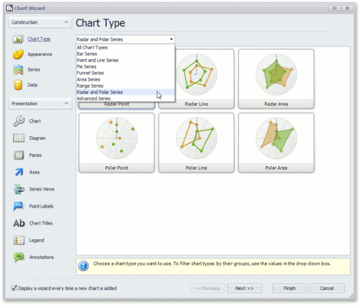
Choose a chart type.
Page Elements
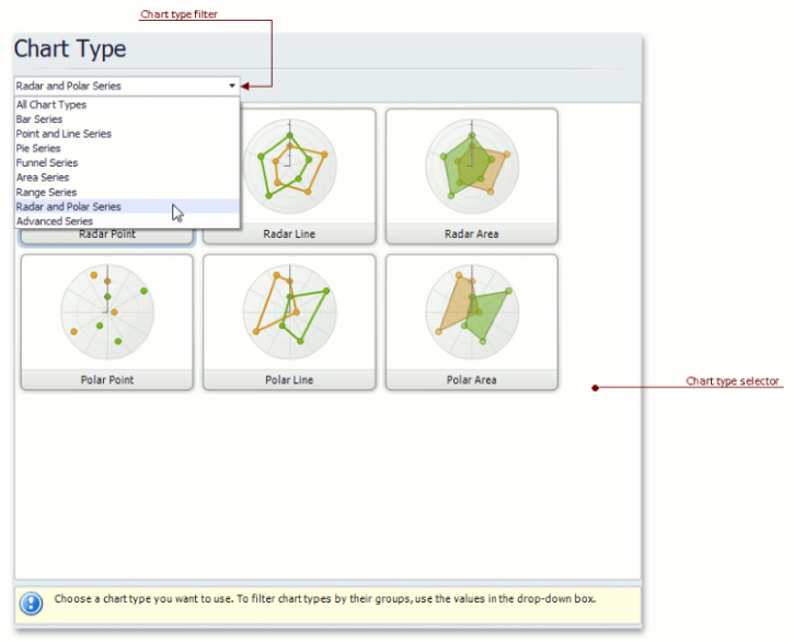
Chart type selector
Contains icons representing chart types. Click an icon to choose the appropriate chart type.
Chart type filter
Filters chart types available in the Chart type selector. The following chart filters are available:
All Chart Types.
Bar Series (Bar, Stacked Bar, 100% Stacked Bar, Side-By-Side Stacked Bar, 100% Side-By-Side Stacked Bar, 3D Bar, 3D Stacked Bar, 3D 100% Stacked Bar, 3D Side-By-Side Stacked Bar, 3D 100% Side-By-Side Stacked Bar and Manhattan Bar).
Point and Line Series
(Point, Bubble, Line, Stacked Line, 100% Stacked
Line, Step Line, Spline, Scatter Line, Swift Plot, 3D Line, 3D Stacked
Line, 3D 100% Stacked Line, 3D Step Line and 3D Spline).
Pie Series (Pie, Doughnut, 3D Pie and 3D Doughnut).
Funnel Series (Funnel and 3D Funnel).
Area Series (Area, Stacked Area, 100% Stacked Area, Step Area, Spline Area, Spline Area Stacked, 100% Stacked Spline Area, 3D Area, 3D Stacked Area, 3D 100% Stacked Area, 3D Step Area, 3D Spline Area, 3D Spline Stacked Area and 3D 100% Stacked Spline Area).
Range Series (Range Bar, Side-By-Side Range Bar, Range Area, 3D Range Area).
Radar and Polar Series (Radar Point, Radar Line, Radar Area, Polar Point, Polar Line and Polar Area).
Advanced Series (Stock, Candle Stick, Gantt, Side-By-Side Gantt).
Tasks
Choose a palette to color a series.
Choose the style specifying the chart's appearance.
Page Elements
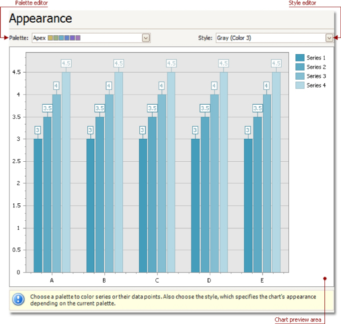
Chart preview area
Previews a chart's layout.
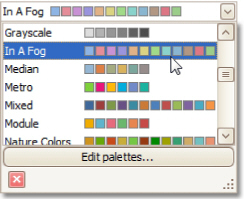
Palette Editor
Specifies a palette to color a series.
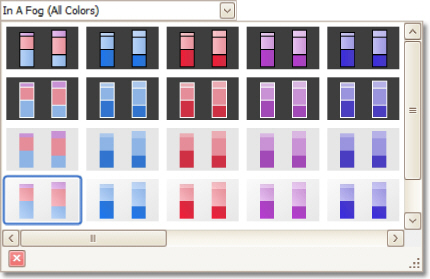
Style Editor
Specifies the style determining the chart's appearance, depending on the selected palette.
Tasks
Create or remove a series of points.
Define the series name, visibility and view type.
Customize additional series options and legend point options.
Enable and customize the Top N Values feature.
Page Elements
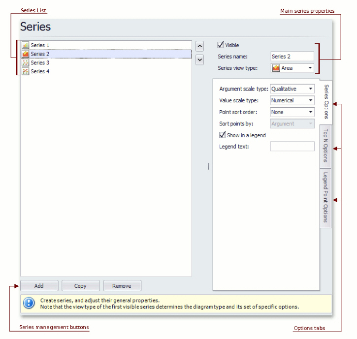
Series list
This list displays all available series. You can click list entries to access properties of the corresponding series. To switch between series, use the and buttons.
Series management buttons
Use the Add, Copy and Remove buttons to manage the series collection.
Main series properties
Choose whether the selected series should be visible, define its name, and select a view type.
Options tabs
The following tabs are available on this page:
Series Options
Specifies argument and value scale types, point sort order, visibility in legend and legend text.
Top N Options
Specifies whether the Top N Values feature is enabled, and allows you to control this feature's options.
Legend Point Options
Specifies the format of values displayed in the chart legend.
Tasks
Provide data for a chart;
Bind a chart or individual series to a data source;
Customize an argument and a value scale type;
Customize the view type of auto-generated series;
Apply data filtering and sorting;
Adjust the Pivot Chart settings.
Page Elements
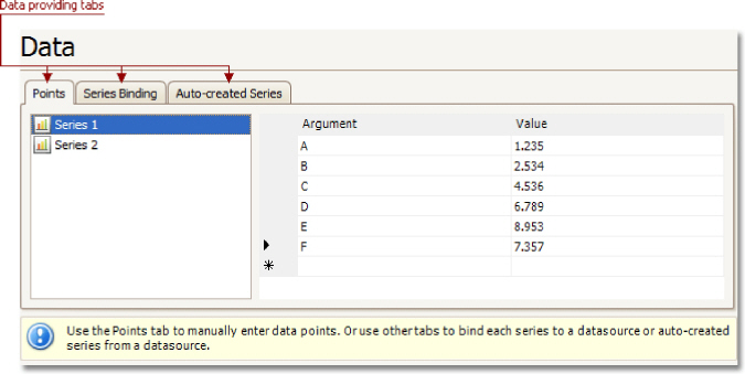
You can provide data for a chart using the following tabs.
Points tab
Series Binding tab
Auto-created Series tab
Points Tab
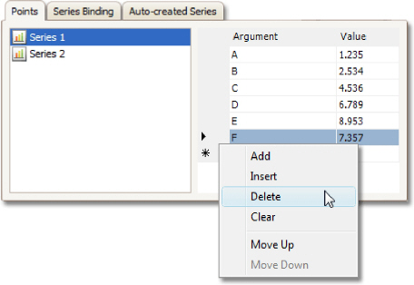
Use it to manually enter data points for series.
Note that valid Argument and Value entries must correspond to the Argument scale type and the Value scale type selected for the appropriate series on the Series Page. Otherwise, an error message will be invoked.
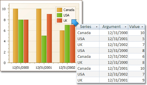
Series Binding Tab
Use it to provide specific data binding options for each series.
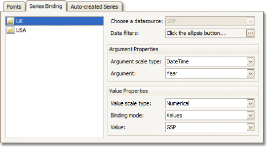
The following illustration demonstrates how it works.
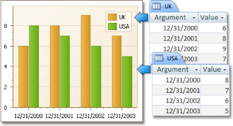
Auto-created Series Tab
Use it to specify data columns used to generate series, as well as the series view type and other options like sorting, filtering and name template.
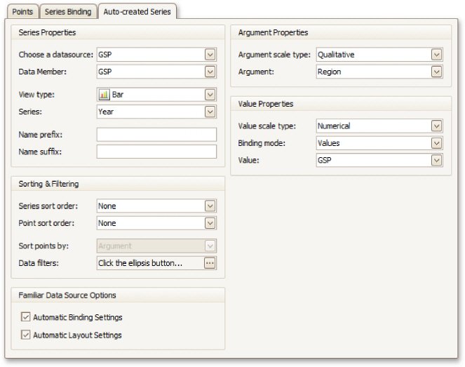
The following illustration demonstrates how it works.
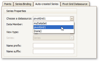
For familiar data sources (such as Pivot Grid), you can choose to automatically adjust the binding and layout settings of your Chart.
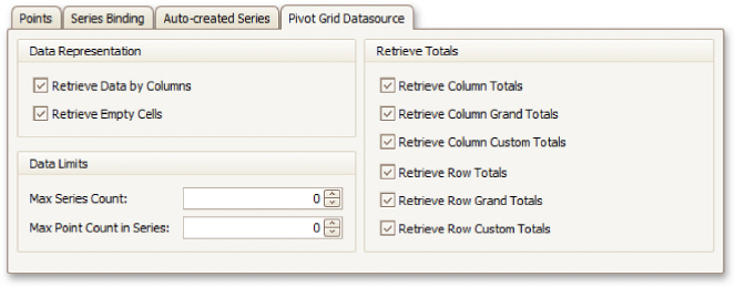
And when you set a Pivot Grid as a Chart's data source, the Pivot Grid Data Source tab becomes available.
On this tab you can adjust various Pivot Chart options.
Tasks
Define a chart's background color and background image.
Page Elements
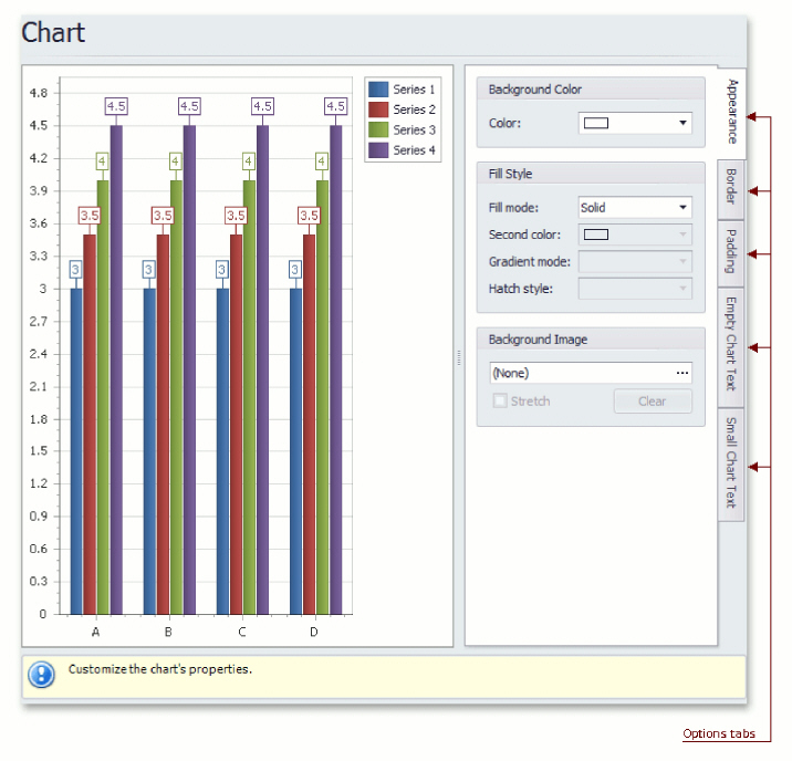
Chart preview area
Previews a chart's layout.
Options tabs
The following tabs are available on this page.
Appearance
Specifies a chart's background color, fill style and background image.
Border
Specifies a border's color, thickness and visibility.
Padding
Specifies the diagram's inner indents.
Empty Chart Text
Specifies the message displayed in the chart when there's no data to display.
Small Chart Text
Specifies the message displayed in the chart, when the chart size is too small to fit the diagram.
Tasks
Rotate a diagram;
Define a diagram's padding;
Add or remove secondary axes;
Add or remove panes;
Define panes' layout direction;
Enable or disable a diagram's scrolling and zooming.
Page Elements
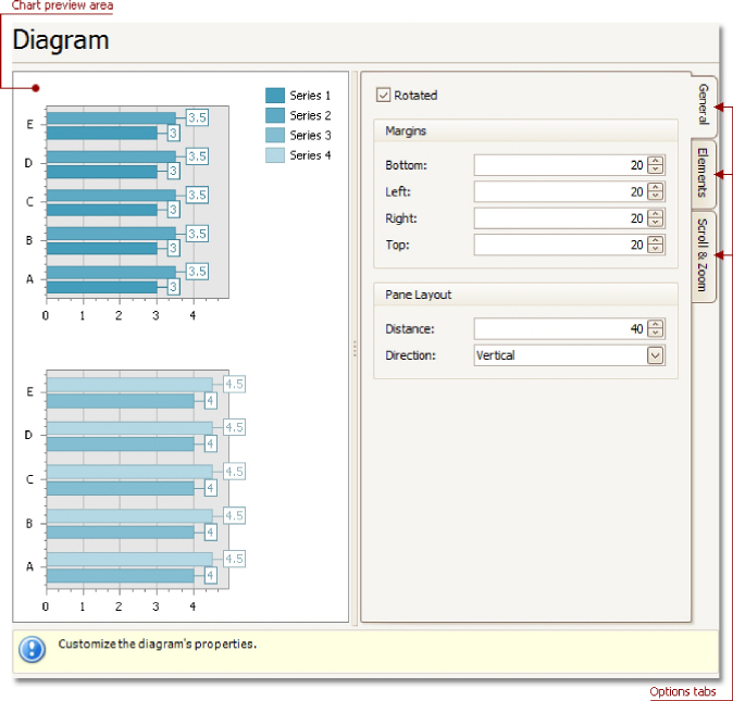
Chart preview area
Previews a chart's layout.
Options tabs
The following tabs are available on this page.
General
Choose whether a diagram should be rotated, set its padding values, and (if it contains several panes) define the panes' layout direction.
Elements
Add or remove secondary axes and panes.
Scroll & Zoom
Enable or disable a diagram's scrolling and zooming, and specify the scrolling and zooming options.
Tasks
Customize panes properties.
Page Elements
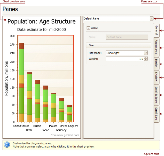
Chart preview area
Previews a chart's layout.
Pane selector
Specifies a pane to be customized.
Options tabs
The following tabs are available on this page.
General
Determines whether the selected pane should be visible, specifies its name, size mode and size value.
Appearance
Specifies a pane's background color and fill style, and its background image.
Border
Determines whether a pane's border should be visible, and defines its color.
Shadow
Determines whether a pane's shadow should be visible, and defines its color and size.
Scroll & Zoom
Enable or disable a pane's scrolling and zooming for specific axes.
Scroll Bars
If scrolling and/or zooming is enabled for an axis, adjust the scroll bars visibility, position and appearance.
Tasks
Customize axes properties;
Customize the appearance of axis labels;
Add a constant line and a strip to an axis;
Enable automatic and manual scale breaks.
Page Elements
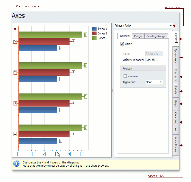
Chart preview area
Previews a chart's layout.
Note that you can select an axis to be modified on the chart preview area directly.
Axis selector
Specifies an axis to be customized.
Options tabs
The following tabs are available on this page.
General
Specifies visibility, position, range and format properties.
Appearance
Defines color, thickness and interlacing options.
Elements
Customizes title, tickmarks and grid line properties.
Labels
Specifies position and text for automatically created labels, or allows custom labels to be defined.
Strips
Allows you to create strips, define their visibility, name, limits, appearance, etc.
Constant Lines
Allows you to create constant lines, define their visibility, name, value, legend text, appearance, title, etc.
Scale Breaks
Allows you to enable automatic and / or create custom scale breaks, and define their appearance.
Tasks
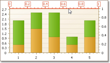
Customize the view-type-specific properties of series;
Customize the appearance and border settings of series;
Add or remove financial indicators (Fibonacci indicators, trendlines and regression lines).
Page Elements
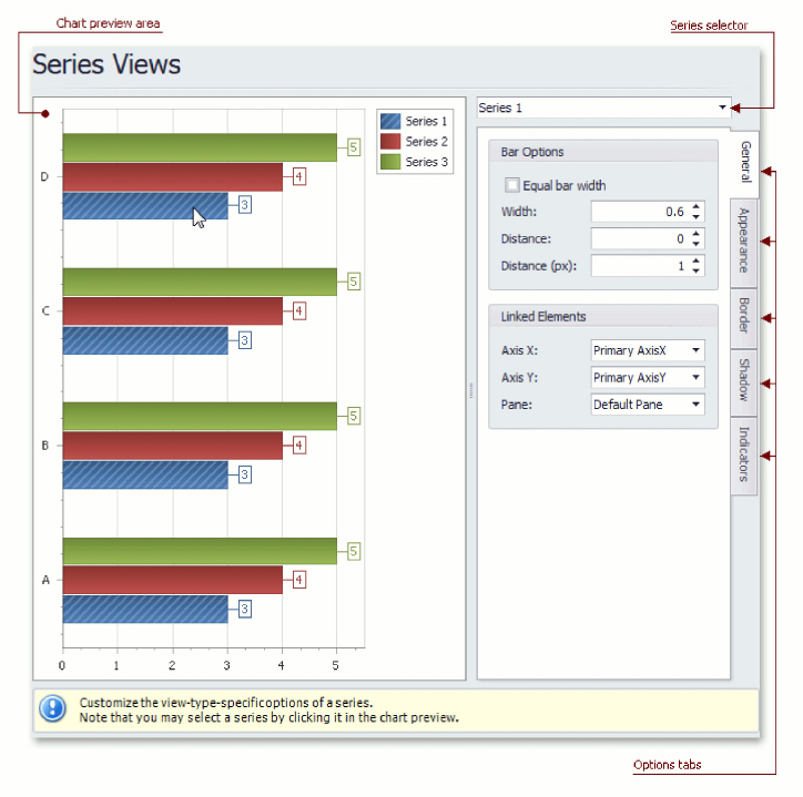
Chart preview area
Previews a chart's layout.
Note that you can select a series to be modified directly in the chart preview area.
Series selector
Specifies a series to be customized.
Options tabs
The following tabs are available on this page.
General
Specifies a series bar's width, distance, color, transparency, etc.
Appearance
Specifies a series color, transparency and fill style. Additionally, determines whether series points should be painted individually.
Border
Determines whether a series border should be visible, and defines its color and thickness.
Shadow
Specifies whether a series' shadow should be visible, determines its color and size.
Indicators
Allows you to add or remove indicators of a required kind (Regression Line, Trend Line, Fibonacci Arcs, Fibonacci Fans, Fibonacci Retracement and many others).
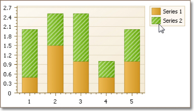
Tasks
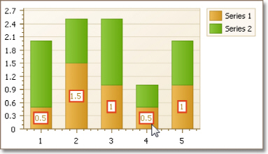
Resolve overlapping of point labels;
Customize the appearance of point labels.
Page Elements
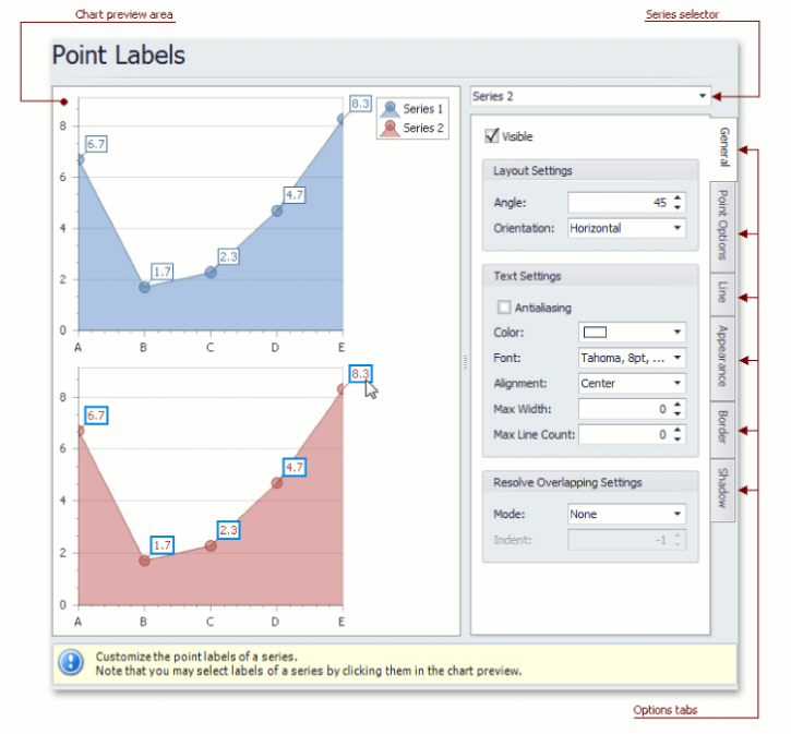
Chart preview area
Previews a chart's layout.
Note that you can select point labels to be modified directly in the chart preview area.
Series selector
Specifies a series to be customized.
Options tabs
The following tabs are available on this page.
General
Specifies whether labels should be visible and shown for zero values, determines their text and resolves overlapping settings.
Point Options
Specifies point view, pattern and value format.
Line
Determines whether label lines should be visible, and specifies their appearance.
Appearance
Specifies the background color and fill style of labels.
Border
Determines whether label borders should be visible, and defines their color and thickness.
Shadow
Specifies whether a label's shadow should be visible, and defines its color and size.
Tasks
Create chart titles;
Enable the word-wrapping for lengthy chart titles;
Customize the appearance and position of chart titles.
Page Elements
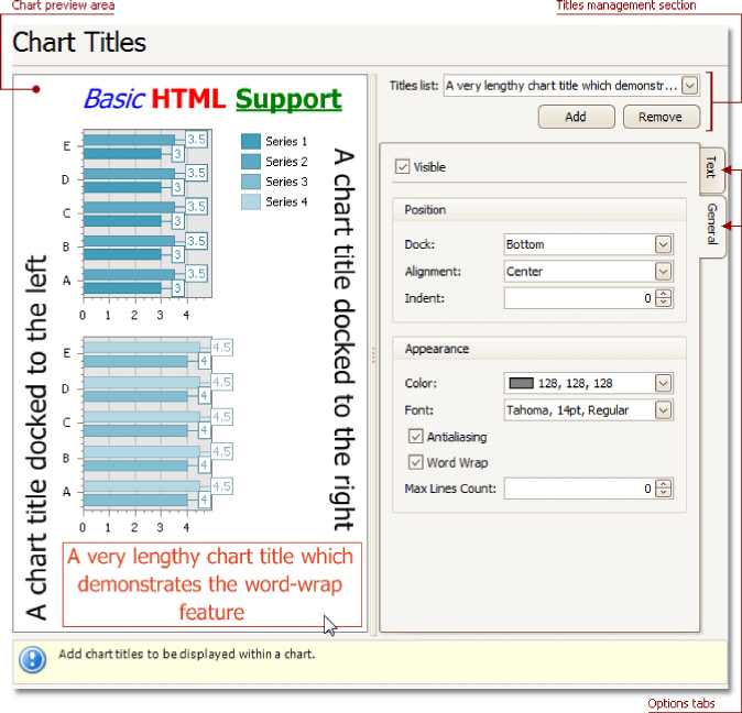
Chart preview area
Previews a chart's layout.
Note that you can select chart titles to be modified in the chart preview area directly.
Titles management section
Allows you to add or remove titles from the titles list, and choose a title to be customized.
Options tabs
The following tabs are available on this page.
Text
Sets a text for the selected chart title. Note that the basic HTML formatting is supported for chart titles.
General
Specifies a title's visibility, alignment and
font options, and determines whether the word-wrapping is
enabled for a title.
Tasks
Customize chart legend's properties.
Page Elements
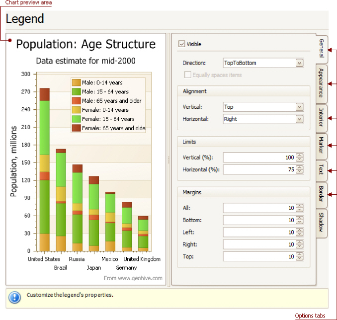
Chart preview area
Previews a chart's layout.
Note that you can select the legend directly on the chart preview area.
Options tabs
The following tabs are available on this page.
General
Specifies legend visibility, direction, alignment, spacing, limits and margins.
Appearance
Specifies legend background color and background image.
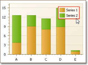
Marker
Specifies visibility and dimensions of legend markers.
Text
Specifies legend text antialiasing, color and font.
Border
Specifies visibility, color and thickness of legend borders.
Shadow
Specifies visibility, color and size of the legend shadow.
Tasks
Create and customize image and text annotations.
Page Elements
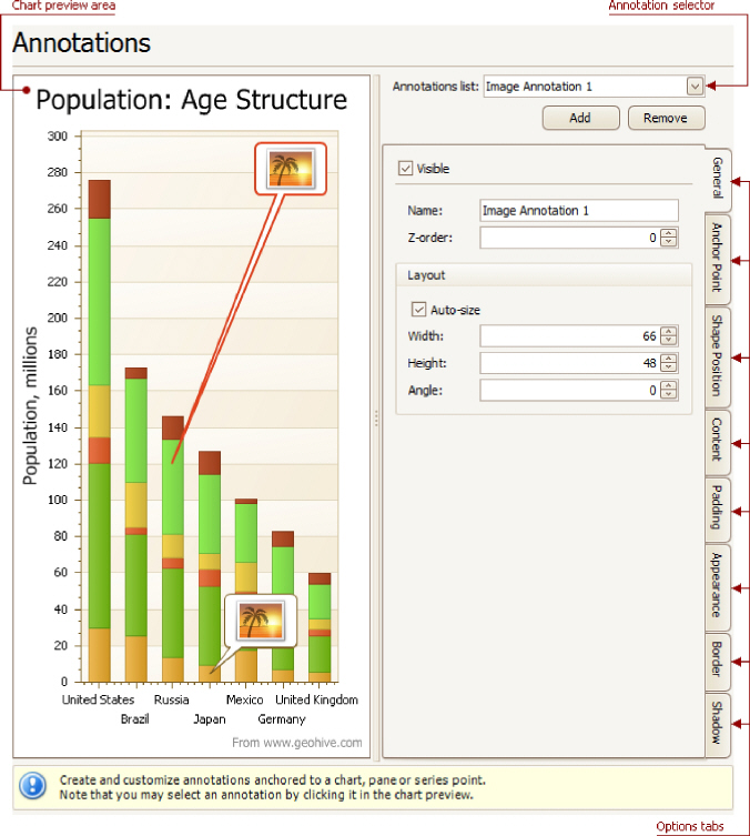
Chart preview area
Previews a chart's layout.
Annotation selector
Specifies an annotation to be created and/or customized.
Note that you can select an annotation directly on the chart preview area.
Options tabs
The following tabs are available on this page.
General
Specify an annotation's name, adjust its visibility, z-order and layout.
Anchor Point
Choose an element to anchor to (chart, pane, or series point), and adjust the corresponding options.
Shape Position
Choose an annotation's shape position type (free or relative), and adjust the corresponding options.
Content
Depending on an annotation's type (text or image), specify its content.
Padding
Specify an annotation's inner indents.
Appearance
Adjust an annotation's background color, fill style, shape and connector options.
Border
Specify visibility, color and thickness of an annotation's borders.
Shadow
Specifies visibility, color and size of an annotation's shadow.
Highlighting and Selection Chart Elements
If you are working with 2D charts, you can highlight and select different chart elements via the mouse or using different gestures on your touchscreen device.
Highlighting
Any chart element that can be selected supports highlighting.
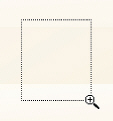
An end user can highlight a chart's area using either the drag gesture on your touchscreen device or via the mouse pointer by hovering over a particular chart element, as shown in the image below.
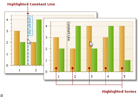
Note: Chart
element highlighting and selection is available only for 2D Chart Types.
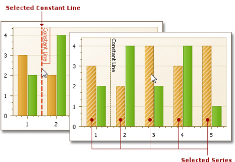
Selection
To select a particular chart element, an end user should tap it on a device supporting touchscreen or click this element using the left mouse button. The following image demonstrates how a constant line and a single series are painted if selected by an end user with the mouse pointer.
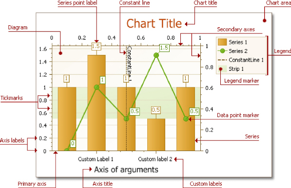
Selectable Elements
Chart elements which can be highlighted or selected are shown in the following illustration.
If you are working with 2D XY-charts (Bar, Line, Point, etc.) or 3D charts, you can zoom in or out of a chart. This allows you to see some of the chart's data in greater detail, or get a more general picture of your data.
Note that zooming is unavailable for 2D Pie, 2D Doughnut, Radar, and Polar charts.
Zoom In a Chart
To zoom in a chart, do one of the following.
Hold down SHIFT and click.
After you press SHIFT, the mouse pointer is changed
to  . Then, move the mouse pointer to the
chart region to be zoomed into, and click (while holding SHIFT). The magnification
factor is 300%.
. Then, move the mouse pointer to the
chart region to be zoomed into, and click (while holding SHIFT). The magnification
factor is 300%.
Press SHIFT and select a region on a diagram.
After you press SHIFT, the mouse pointer is changed
to  . Then, select a zoomed region by dragging
the mouse pointer.
. Then, select a zoomed region by dragging
the mouse pointer.
After releasing the left mouse button, a chart is zoomed into the bounds of the selected region on a diagram.
 Note
Note
This feature is available for 2D charts only.
If you press SHIFT and can't zoom in anymore
(the mouse pointer is changed to  ), then a chart is
already zoomed in by 100
times (10000%). This is the maximum possible
zoom factor allowed.
), then a chart is
already zoomed in by 100
times (10000%). This is the maximum possible
zoom factor allowed.
Use CTRL+PLUS SIGN.
In this case, the magnification factor is 120%.
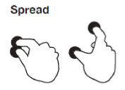
Use the spread gestures on a touchscreen device.
An end-user can zoom in a chart's diagram performing spread gestures on any device supporting touchscreen.
Use the mouse wheel.
In this case, the magnification factor is 120%.
Zoom Out of a Chart
To zoom out of a chart, do one of the following.
Hold down ALT and click.
After you press ALT, the mouse pointer
is changed to  . Then,
move the mouse pointer to the region to be
zoomed out, and click (while holding ALT). The magnification factor is
300%.
. Then,
move the mouse pointer to the region to be
zoomed out, and click (while holding ALT). The magnification factor is
300%.
Use CTRL+MINUS SIGN.
In this case, the magnification factor is 120%.
Use the pinch gestures on a touchscreen device.
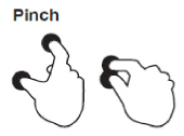
A chart's diagram can be zoomed out by performing pinch gestures on any device supporting touchscreen.
Use the mouse wheel.
In this case, the magnification factor is 120%.
Undo Zooming
Press CTRL+Z to return to the state before the first zoom operation in a series.
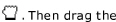
You can scroll a chart if either the axis visible range is reduced or a chart is already zoomed in (its zoom factor is more than 100%). Since the entire chart is not visible at one time, it's possible to scroll a chart.
Scroll a 2D Chart
To scroll a 2D chart, do one of the following:
Hold down the left mouse button, and drag it.
After you hold down the left mouse button, the
mouse pointer is changed from 
 mouse pointer to scroll the diagram.
Use scrollbars.
An end-user is able to click a scrollbar arrow, click the scrollbar near the thumb, or drag the thumb and move it.
In this instance, a chart's diagram is scrolled in the same way as controls in used Windows applications.
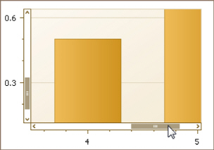
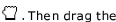
Use flick gestures on a touchscreen device.
An end-user can scroll a diagram using flick gestures on a touchscreen device.
Use CTRL+ARROW combinations.
When an end-user presses CTRL + LEFT, a chart's diagram is moved to the left.
When an end-user presses CTRL + UP, a chart's diagram is moved to the top.
When an end-user presses CTRL + RIGHT, a chart's diagram is moved to the right.
When an end-user presses CTRL + DOWN, a chart's diagram is moved to the bottom.
Scroll a 3D Chart
An end-user can perform chart scrolling doing one of the following:
Hold down the mouse wheel button on a chart and drag it.
After you hold down the mouse wheel, the mouse
pointer is changed from 
 mouse pointer to scroll a chart's diagram.
Use CTRL+ARROW combinations.
Use flick gestures on a touchscreen device.
An end-user can scroll a diagram using flick gestures.
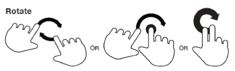
If you are working with 3D charts, you can rotate a chart's diagram. This may be required if a chart displays multiple series or data points, and it's required to change the current rotation angle to view the chart data in detail.
To rotate a chart control, do one of the following:
Hold down the left mouse button on the diagram and drag the mouse pointer.
After holding down the left mouse button, the
mouse pointer is changed from 
 mouse pointer to rotate the chart.
Use rotation gestures on a touchscreen device.
Touch a 3D chart's area with two fingers and move them in a clockwise or counterclockwise direction.