![]()
Filter Elements Overview |
The Dashboard Designer allows you to create three types of filter elements that provide the capability to filter other dashboard items.
To add the required filter element to the dashboard, use the Filter Elements button in the Home ribbon tab.
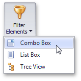
If you are using the toolbar menu, use the  button to add the required filter element.
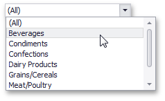
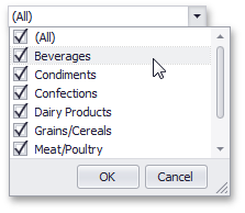
The Combo Box dashboard item allows end-users to select a value(s) from the drop-down list.
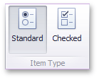
You can switch the combo box type in the ribbon Design tab.
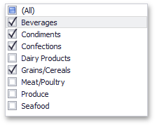
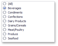
The List Box dashboard item allows end-users to select a value(s) from the list.
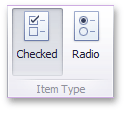
You can switch the list box type in the ribbon Design tab.
The Tree View dashboard item displays values in a hierarchical way and allows end-users to expand/collapse nodes.
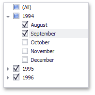
You can manage the initial expanded state of filter values using the Auto Expand button in the Design ribbon tab.
